Gendius
Role
Product Designer
Timeline
Mar 2018 – May 2021
Market
🇬🇧 UK and 🌍 Worldwide
Stack
Sketch, Zeplin, Figma, ProtoPie, Wordpress, React, React Native
Website
gendius.co.ukThe story...
At Gendius, I had the privilege of working on some great projects and learned a lot in the process. I'm really grateful for the opportunity to work in such a tight-knit environment, with just 4 people at the time. Here's a peek at the projects I led:
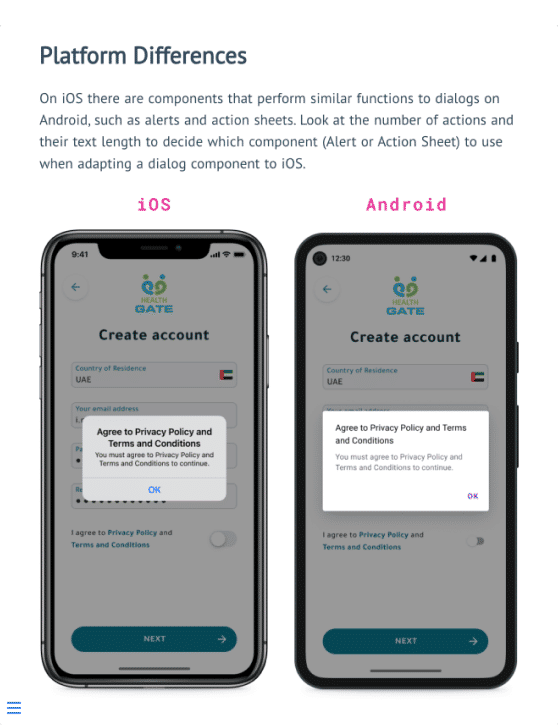
Health Gate for AstraZeneca
Conceptualised and led the design of a healthcare app platform for AstraZeneca in the Gulf region.
Read more


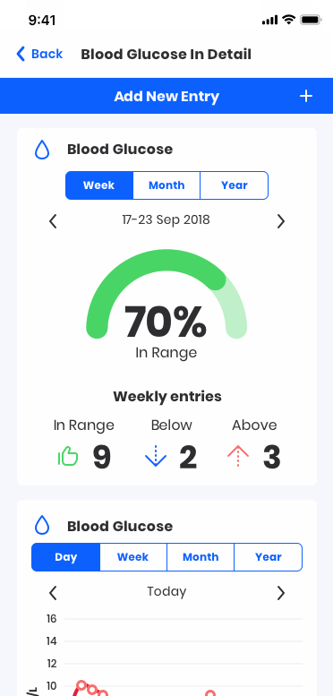
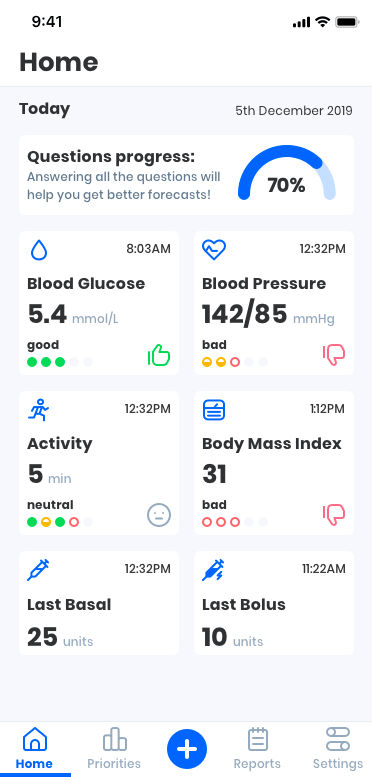
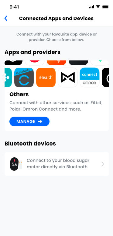
Intellin app
Designed an app-based platform to assist people in understanding diabetes and its secondary complications.
Read more
Intellin dashboard
Designed a dashboard to bridge primary care providers with patients through the Intellin app.
Read more

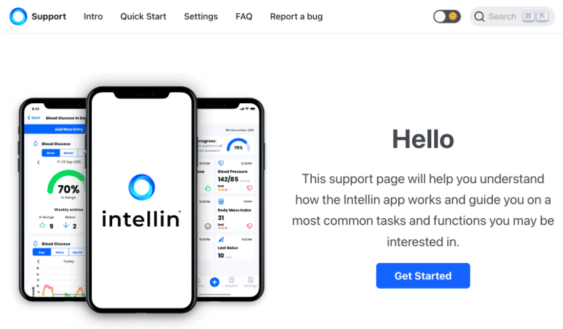
Intellin support page
Built and managed the Intellin support page (docusaurus, netlify), continually updating the knowledge base content.
Visit website
Intellin Website
Designed, built and launched the Intellin website.
Read more

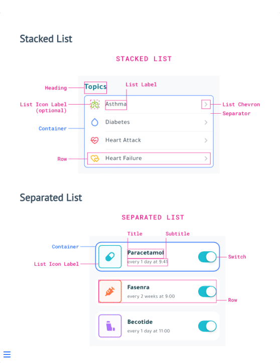
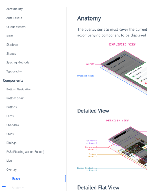
Intellin Design System
Created and maintained a design system used in the Intellin platform.
Writing in progress...
Motion
Created variety of animations/educational and promotional videos.
Read more