Helping people with diabetes
Intro
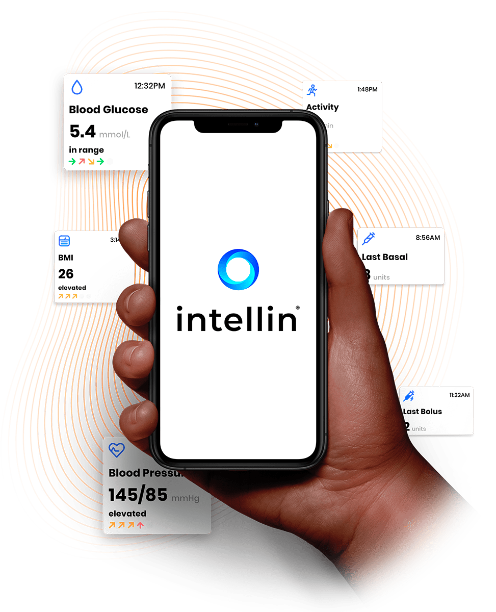
Intellin is an app-based platform that helps people with diabetes understand their risk of secondary complications. With over 500k global downloads within a year, Intellin aids in tracking and managing the condition by allowing patients to input their information. A specialised risk engine can then determine if a patient is at risk of developing complications in the eyes, heart, brain, kidneys, or feet.
As the lead product designer, my role was to build an app interface for iOS and Android, as well as a web dashboard interface for clinicians. One of our challenges was to build a tool tailored to the individual and their specific type of diabetes.
Results and outcomes
- The app was downloaded over 375k in 170 countries with virtually no marketing budget,*
- Over 2,000 downloads a day,*
- Over 22% 30 day retention,*
- Over 74k MAU (monthly active users),*
- Blood Pressure - 3.5% reduction in systolic & 6.6% reduction in diastolic (Over 6 months),
- Built a partnership with AstraZeneca (GCC region) which resulted in launching their own flavour of the app and embedding the Intellin functionality,
- We've found that patient who have prolonged issues with feet (neuropathy) will likely develop chronic kidney disease (CKD) - based on Intellin ~30k data points from 2019-2020 (in collaboration with Nottingham University ADAC)
Data source: Jan 2019 – Apr 2020, internal App Store/Google Play console and Sensor tower
Some background
Diabetes is a condition in which the body can't produce enough insulin (type 2) or any insulin at all (type 1) - insulin is a hormone, that controls blood glucose levels in our bodies. The disease can be developed by women during their pregnancy, this is called gestational diabetes.
What about the numbers? The estimated number of people with diabetes (in the UK alone) is around 5 million, the NHS spends at least £10 billion a year on diabetes alone - that's 10% of the NHS budget! Future projections aren't looking too rosy either - looking at worldwide numbers, the amount of people with diabetes is projected to rise from 537 million to 643 million in 2030.
Diabetes is also a massive contributor to secondary complications, which may result in:
- Leg amputations,
- Kidney disease or blindness,
- Heart attack,
- Strokes,
- Death.
Sources:
https://www.diabetes.org.uk/ (accessed June 2022)
https://diabetesatlas.org/ (accessed June 2022)
https://www.ncbi.nlm.nih.gov/pmc/articles/PMC27454/ (accessed June 2022)
Where did we want to help?
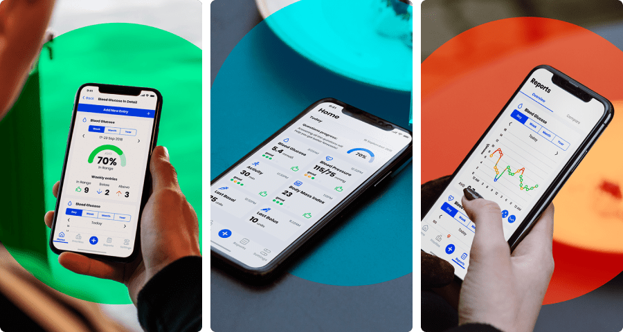
Because diabetes is quite a complex condition, our main area of interest was around secondary complications that may develop throughout the disease. We were looking to combine all the data inputs that users can provide themselves (blood glucose levels, blood pressure, activity etc.) and pool it with occasional survey questions (clinical questionnaire) that users can answer in their spare time. This information was used to build an algorithm that could provide estimates around the progression of diabetes.
Of course, the information wouldn't be just useful to the user but also to the clinicians who could advise on what course of action to take - This is how the Intellin dashboard came to life (which I discuss in the later stage).
First inceptions of the app
If I recall correctly there were 2 main concepts of the app before my tenure at Gendius. One of these concepts was already working and ready to be used in the Diabetic Foot Ulcer study at Salford Royal Hospital.
Research
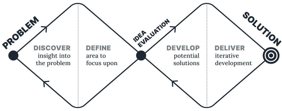
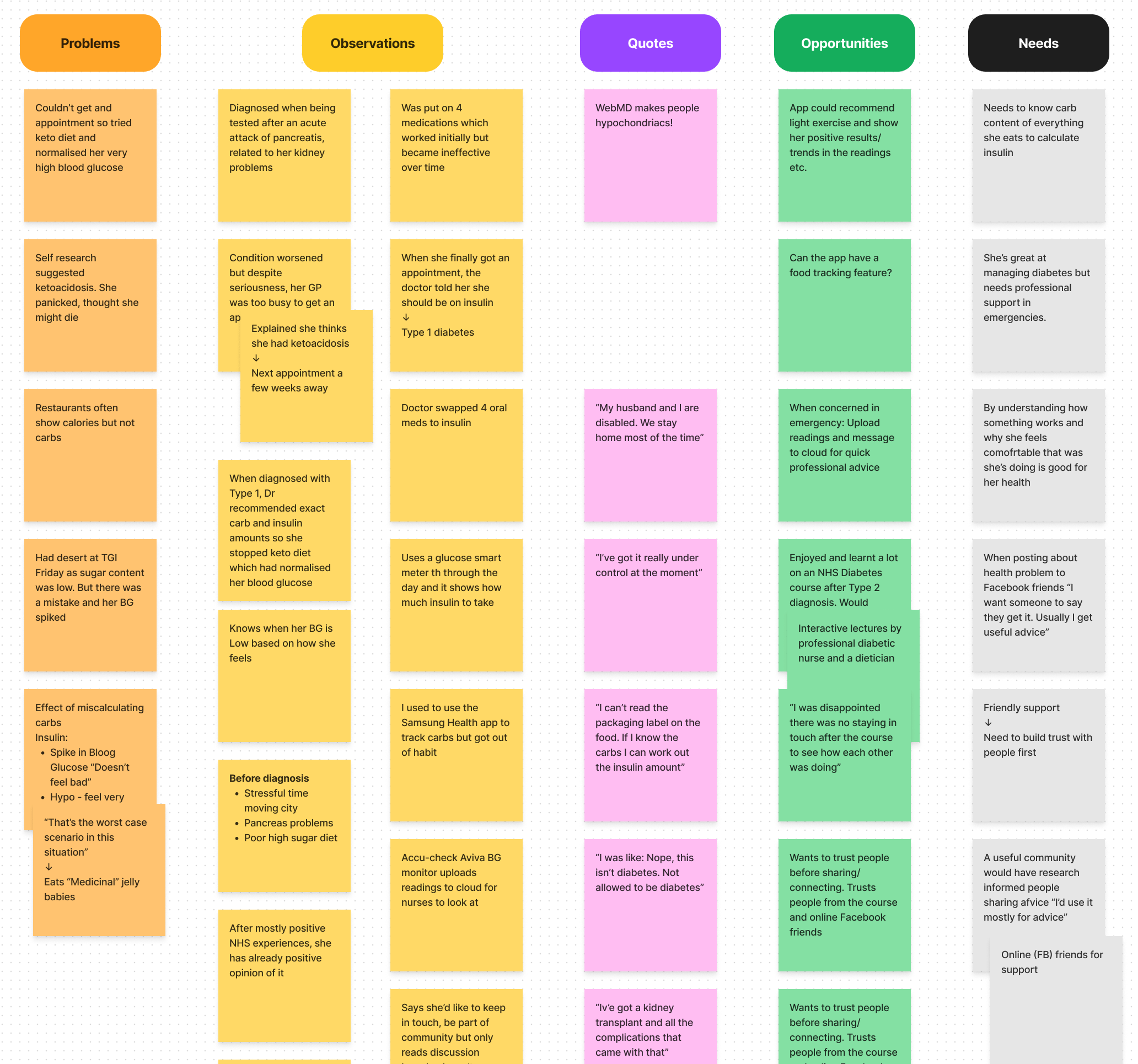
At Gendius, we were performing qualitative research that would help us align the business goals with users' needs. My work included working with the external research team, to produce and iterate prototypes of the user interface and flows.
User flows
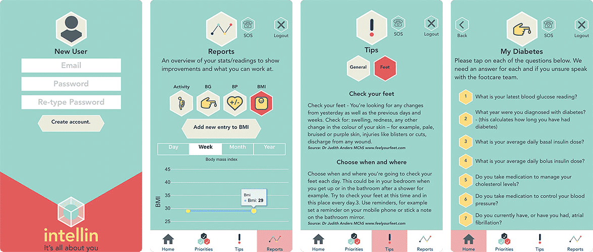
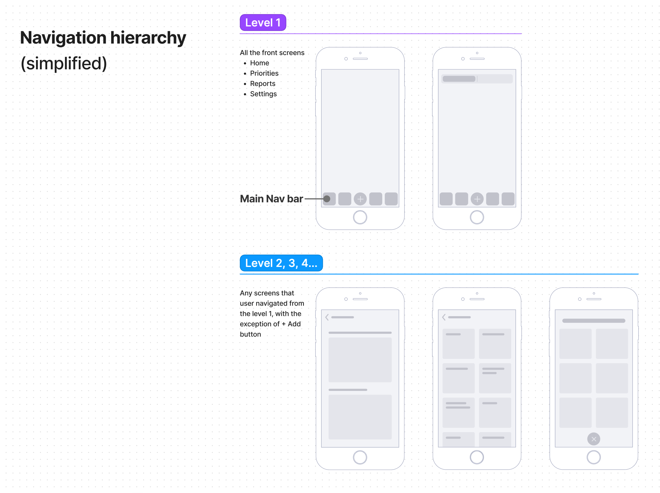
By collecting the research findings that we had in place, I've started looking at optimal IA/user-flow that we can use in our platform. We've collectively agreed on this user flow and began testing the navigation, largely based on Apple's HIG (Human Interface Guidelines) for our MVP.
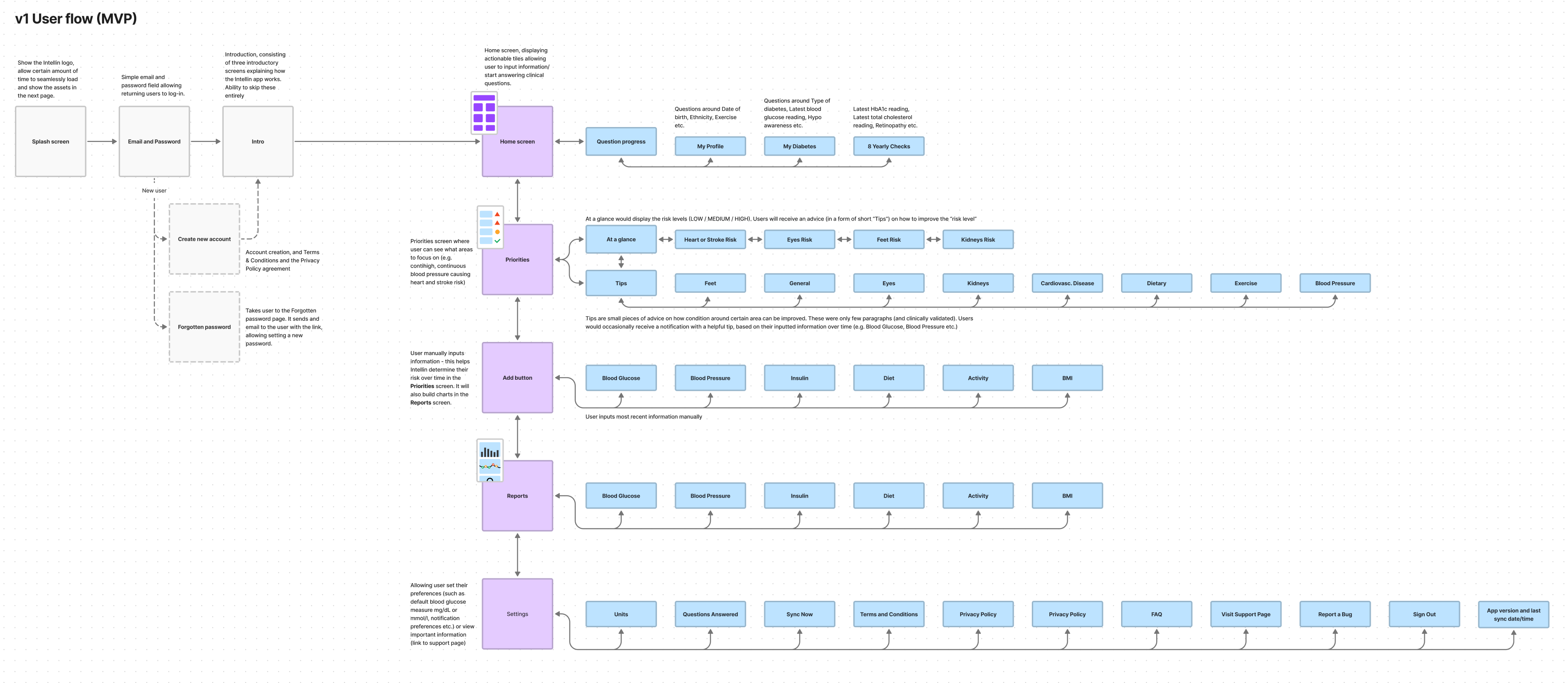
The navigation hierarchy could pose a challenge for when we want to display the main navigation bar (Tab Bar as per iOS guidelines), and hide it so as not to confuse the user (e.g. when performing an important action). The navigation bar stayed on the screen on the 1st level (Home, Priorities, Reports, Settings), the exception was the +Add Button screen, as we wanted the user to focus on the task at hand and not to navigate away from this crucial screen.
Prototyping
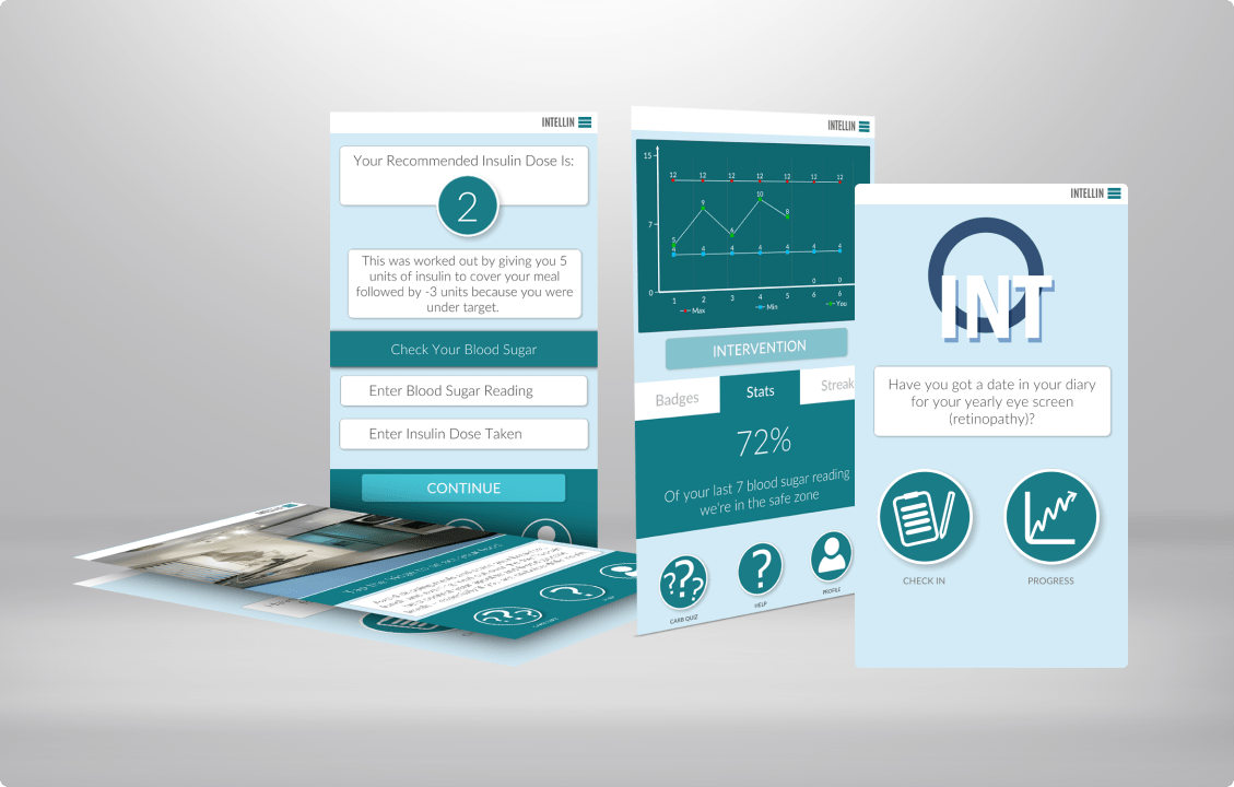
For the very first prototype: since our research was running on full steam, I had very little time to come up with a solution that would work on Android/iOS seamlessly (on a participant device). I've decided to use the paper format prototype. Personally, I am not a fan of paper solution (since it doesn't give the desired interaction degree and it's quite abstract), however, was satisfied with the outcome and feedback that we gathered together with the research team.

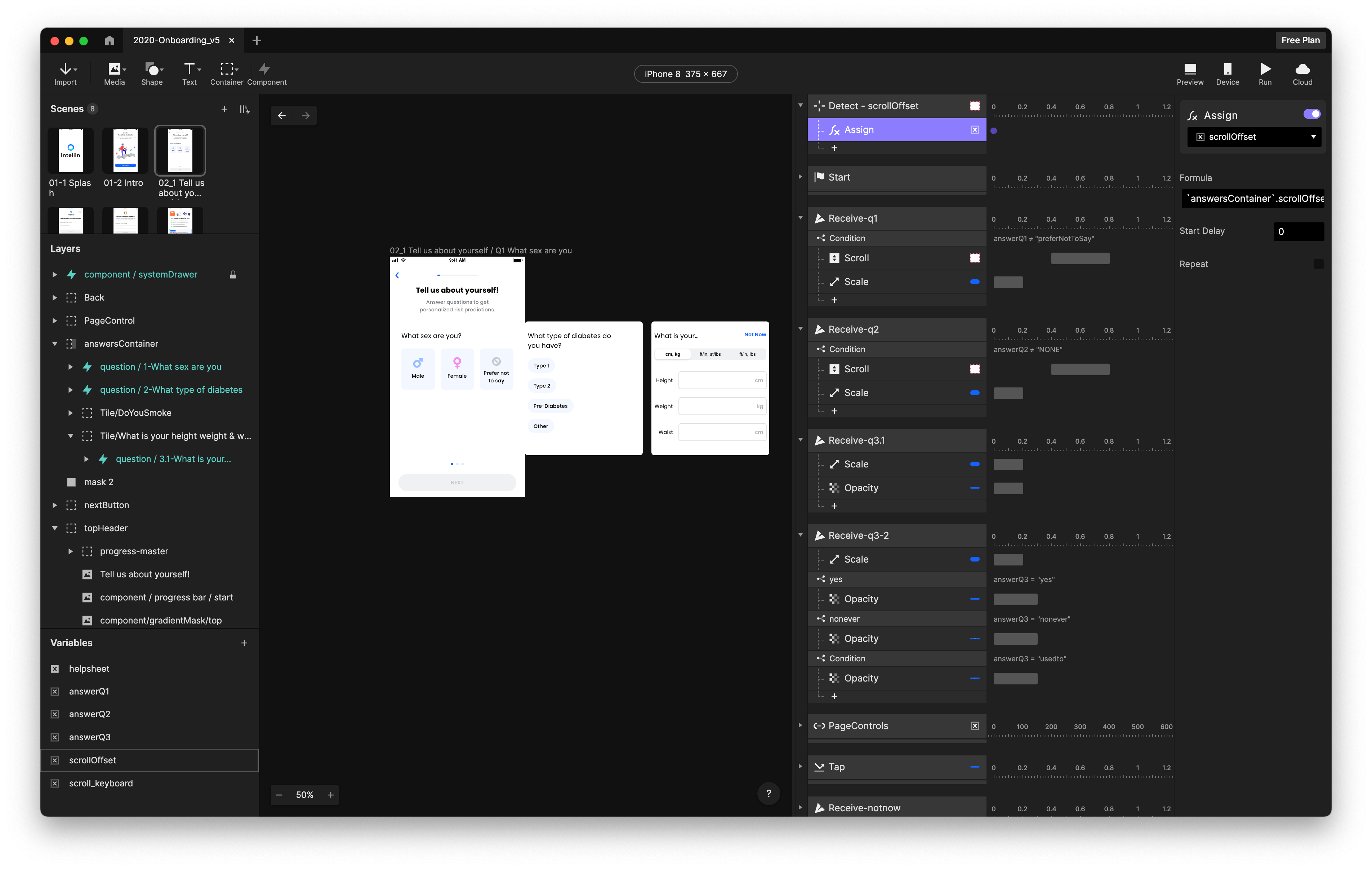
It was the post-MVP launch that I finally could try hi-fidelity prototyping. We had quite a good chunk of new features on our backlog (like connected devices, charts compare etc.) that I wanted to implement in the prototype and gather some feedback from the stakeholders and our patient group (User Research participants) that we stayed in touch. ProtoPie was my tool of choice as Sketch and Figma (which was still in beta I think) lacked the interactions at the time I was looking for.
Design system
As you've probably noticed there are UI design differences above (between the paper vs the hi-fi prototype). The design on the paper prototype was treated as more of an "intermediary" one, before the work of a design system that would align with the rest of the branding.
The idea of the Design system isn't a new one of course. The first inceptions of the Intellin app weren't following any guidelines at the time (Apple HIG or Material design) and weren't built with scalability in mind. My approach was to build a system that could be used in mobile and a web app (clinician dashboard) that we had in the pipeline.
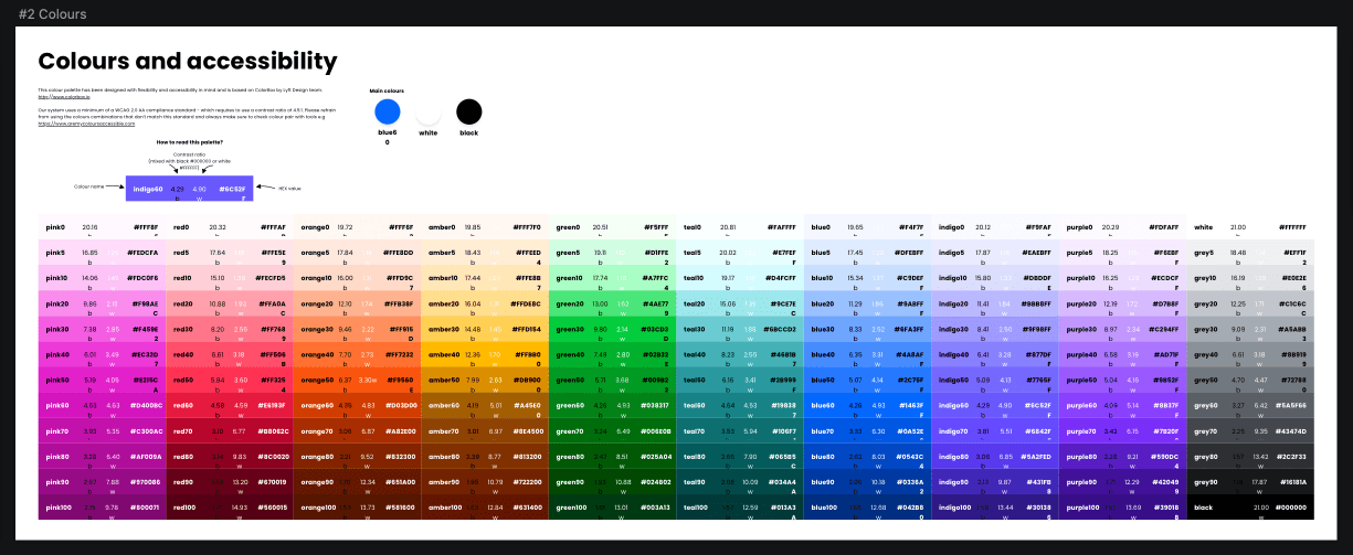
For the colour system, I took my inspiration from the Lyft design team who was working on a consistent and accessible scheme. The Lyft team has created an awesome tool called colorbox. In essence: the tool allows to create a set of a colour (e.g. Blue), then using an algorithm involving the calculation of HSB (Hue, Saturation, Brightness) and amount of steps (number of colours), colours (lightness to darkness) can be made consistent across the colour hues.
In our case, we had 12 shades per colour (red0, red5, red10, red20...red100), which in total gave us 120 colours. It seemed like overkill at the time, but we've managed to use around 70% of the colours from the system, also we've used the PurgeCSS library to remove any unused colours (code) in the web app.
The accessibility was the main driver to create this consistent colour system, any colour set (e.g. blue, red etc.) from 0-50 is accessible on black (4.5:1), and from 60-100 accessible (4.5:1) on white.
The font family choice for the Intellin app was Poppins - a bold, geometric sans-serif font, that was both playful and easy to read. The system comprised of H1-H5 headings, Button Label, Caption etc. and was loosely based on the Material Design font system at the time.
Grid is based on the 8px/dp system, to achieve a clear and consistent hierarchy.
Components were built in Sketch libraries, so could be easily re-used and iterated on to adapt to new requirements/features.
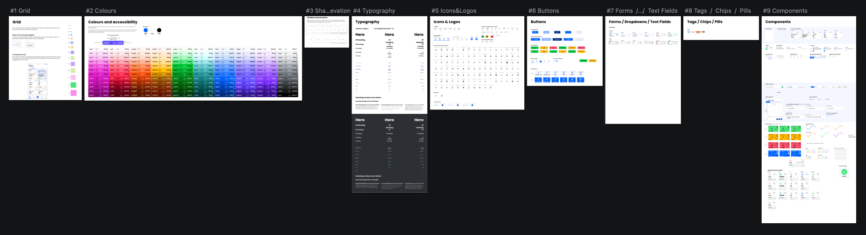
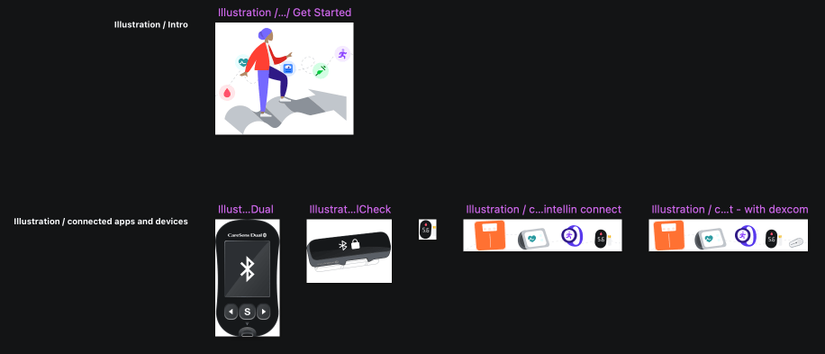
The design system also included a library of illustrations used in the Intellin app and Intellin dashboard.
New features, iterations
The Intellin platform (app and clinician dashboard) is continiously iterated and improved upon. The new features and iterations were driven by:
- Business needs (our internal roadmap),
- Periodical questionnaires sent to our users who've opted in to receive such questionnaires (Surveymonkey),
- Requests/messages landing on our support email,
- Analytics done via Google Analytics for Firebase,
- Feedback from the clinical team that run trials using the Intellin dashboard
The tasks were prioritized based on severity (e.g. crucial bugs/blockers) on our bi-weekly sprints. This format of sprints allow me to work on prototypes, testing and iterating on new features. The feedback I've gathered from other stakeholders and our closed patient group, let me iterate the prototypes until we've agreed on the "satisfactory" version that was ready for the developer hand off.
Registration screen
One of our weakest spots in the app was the registration screen. We've noticed quite a big drop-off on this screen (~38% bounce rate) additionally around 29% of users (after they registered) didn't add any data input.
We've recognised that the registration process can be vastly improved and our onboarding (intro) screen lacked any value proposition/value exchange for the user (when asked our patient group and gathered the answers from the Surveymonkey).
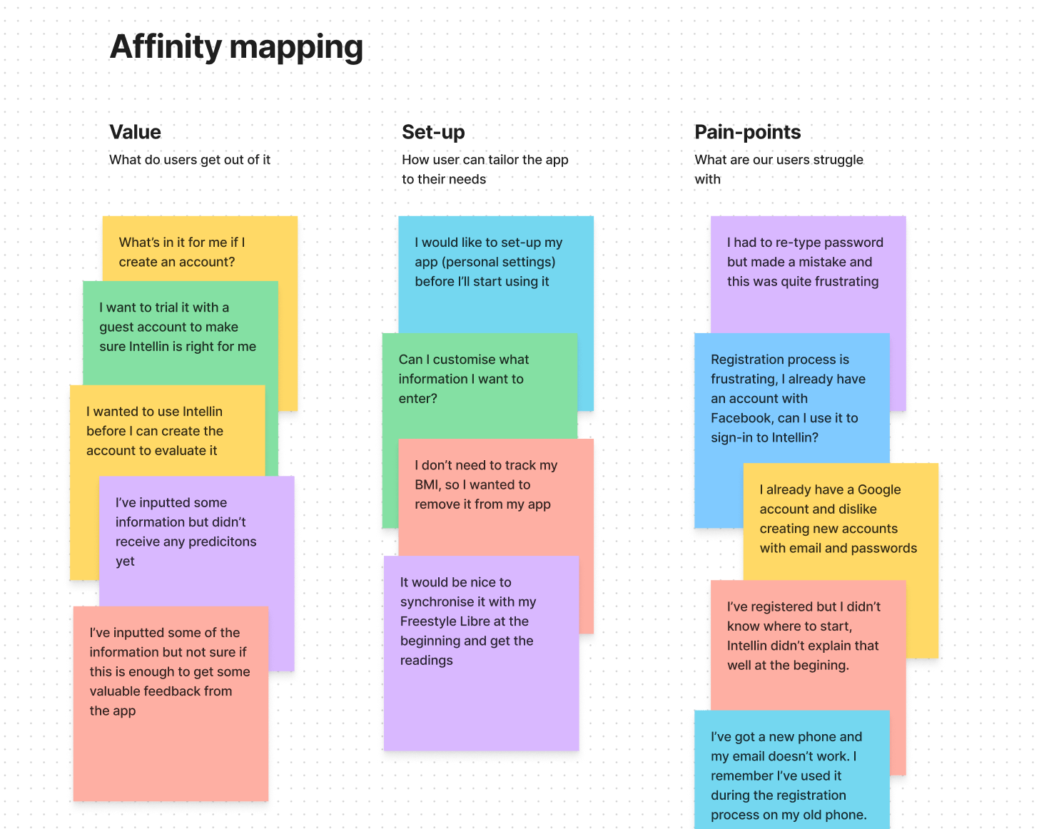
Prototypes and user flows
After collecting the feedback, I've started toying with the ideas our team collectively shared. In total, I've created 6 iterations of the registration + onboarding process.
The very first prototype (a concept known as v0), was done mid-surveying. The idea was to present a better and what Intellin does. I also wanted to utilize current patterns to release the first iteration fast, however, given that more themes were emerging in our research, and the dev team was working on more important things (bug fixing), we've decided to explore more.
In the second iteration of the flow (and prototype) I've received some input from other stakeholders, that I've not necessarily agreed with (the number of screens, messaging etc). To put the arguments for/against I've created the prototype, which allows us to test the flow properly and gather feedback from our users. This also allowed us to start with many ideas and eventually condense them to a satisfactory amount (driven by our users' feedback).
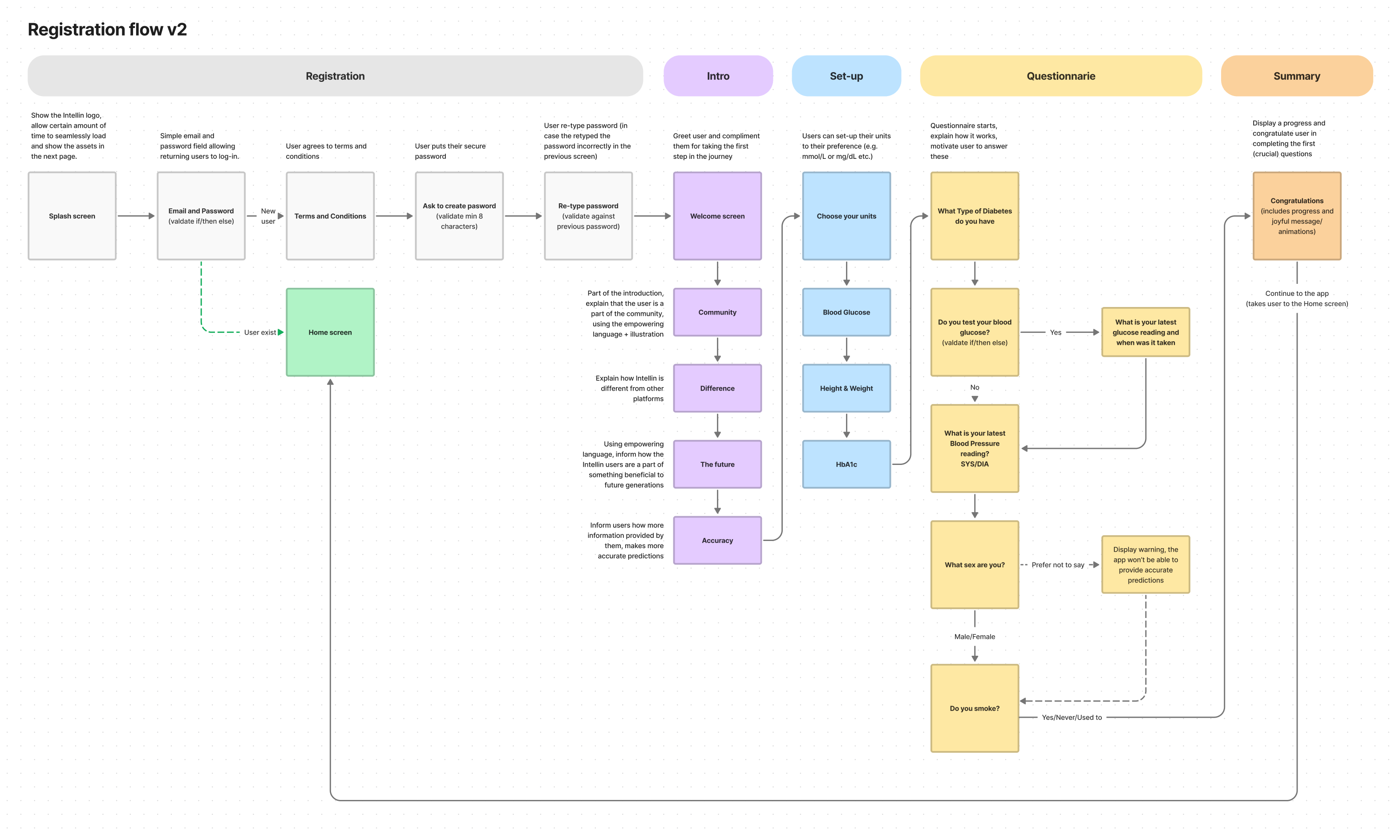
Finally, we had a good idea of how many questions we were going to ask, and how many screens we were going to show to the user. The prototype includes new features, like SSO (Single Sign On), a new subscription model that allows users link to over 120+ connected devices (blood glucose meters, blood pressure cuffs etc.)
Results and outcomes
- Improved value proposition,
- Massively improved the sign-up process (most of our users prefer Google/Apple sign-in), bounce rate dropped to ~15%,
- Received more valuable answers and data inputs,
- Satisfactory rate of the Subscription sign-ups (~10 p/m) vs our projections
Future of the Intellin app
Tools used: Sketch, ProtoPie, AfterEffects, Rotato, Blender
A good few months - before leaving Gendius - I was working on concepts for the app, and what it could look like in the future (given if we would have enough dev manpower to implement these). It's a compilation of user feedback we've received over the course of my tenure and Gendius (this video was presented to our patient group, among others). New features would include:
- Totally revamped the "Priorities" screen using 3d models (as I am not that versed in Blender, we hired a freelance artist whilst I was focusing on the art direction). I was greatly inspired by Once Upon a Time... Life animated series which I remember from my childhood days...
- Customisable and inclusive 3d Avatars,
- Better charts in the "Reports" screen, compare Blood Glucose and Carbs, see Trends
- Better "Home" screen tiles, replaced the "dot" traffic light system for more familair for people with diabetes "arrows"
- Ability to customise "Home" tiles, switch between arrows and a sparkline chart (e.g. for connected CGMs - Continuous Glucose Monitors)