Connecting patients with primary care
Intro
The Intellin platform's significance is largely due to the HCP (Healthcare Provider) Dashboard, which is crucial for remote monitoring, early warning, rapid response, triage, and social prescribing.
My work here included:
- Building and maintaining the design of the dashboard (end to end),
- Working closely with clinicians (GPs) and collecting feedback from them to improve the platform,
- Testing and iterating on the ideas (business needs vs feedback from the clinicians) static designs and prototypes,
- Producing and maintaining a documentation around the HCP Dashboard.
First version (outsourced)
The very first version of the dashboard has been outsourced and built by the agency specialised in Health Informatics. This is not to say the dashboard was bad (it wasn't), but the amount of time took to request a feature/change + costs tied to the regression wouldn't make sense in a long run, hence we've slowly moving the project in-house. The very first version was built around the time I've joined Gendius (March 2018), but it wasn't until (early) 2019 when I fully worked on the re-design/starting from scratch project. At this point I was just retro-fitting features for the existing dashboard (e.g. charts) based on the business needs. The first version was more of a proof of concept and tested in the clinics during the DFU (Diabetic Foot Ulcer) trial at Salford Royal Hospital (Podiatry unit).
Second (in-house) version
This is where things started to get more serious, the second version of the HCP dashboard was built in-house (pretty much from scratch). We've learned a lot from the first (proof of concept) version, and applied the learnings to our new dashboard.
The key changes/additions (among others) included:
- Design - matching the Intellin app language, component built in the way so can be re-used in the app and (web) dashboard with baked-in accessibility (WCAG 2.0 including 4.5:1 contrast ration),
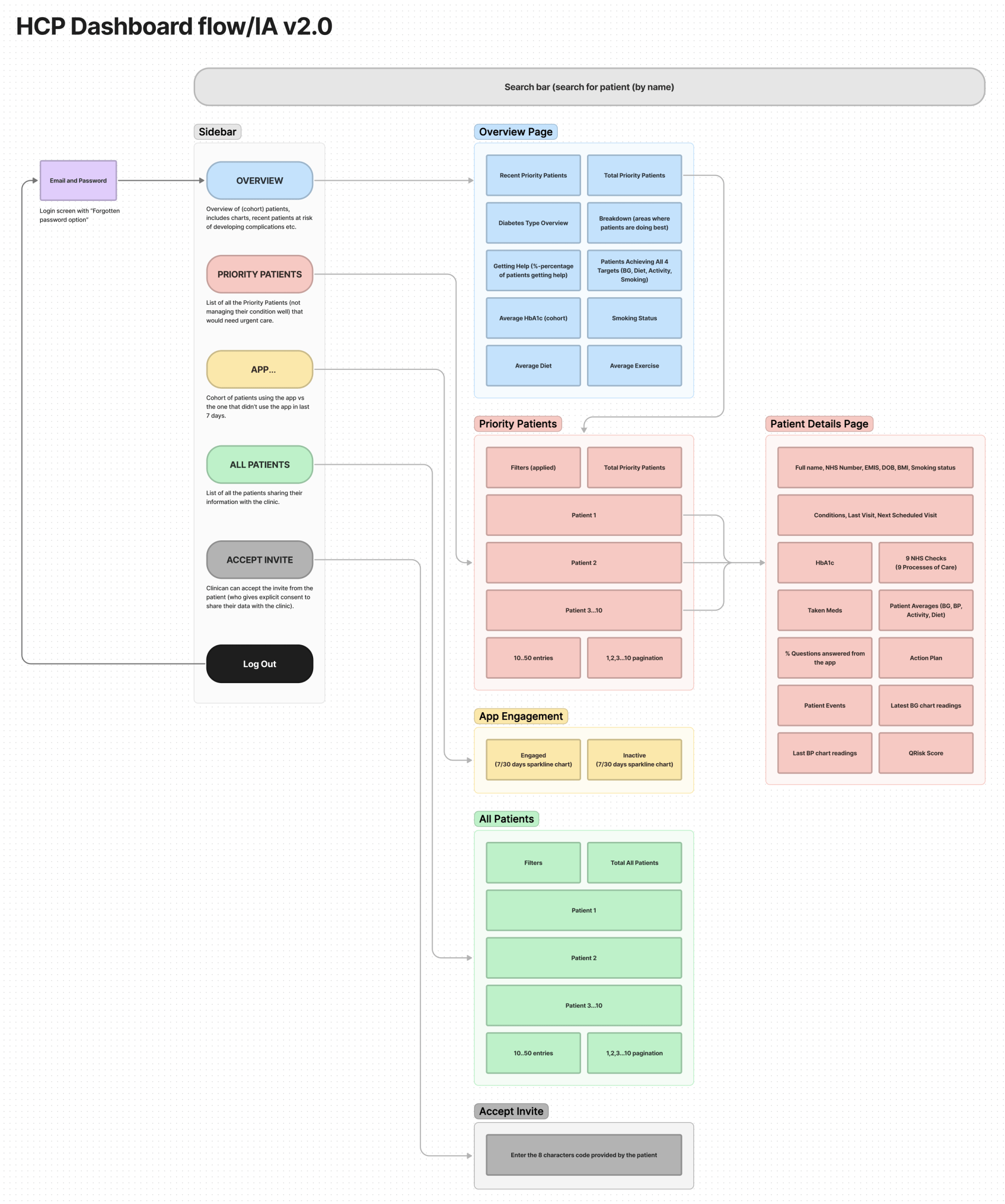
- Navigation - I've researched countless amount of other dashboards and standardised the way our (dashboard) would follow the most common navigational patterns,
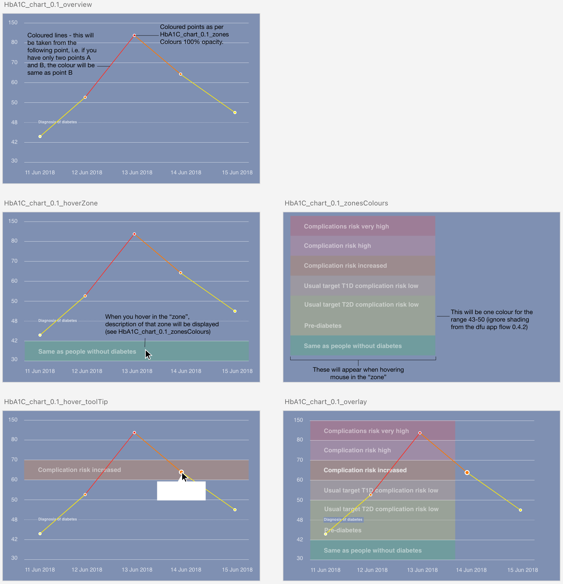
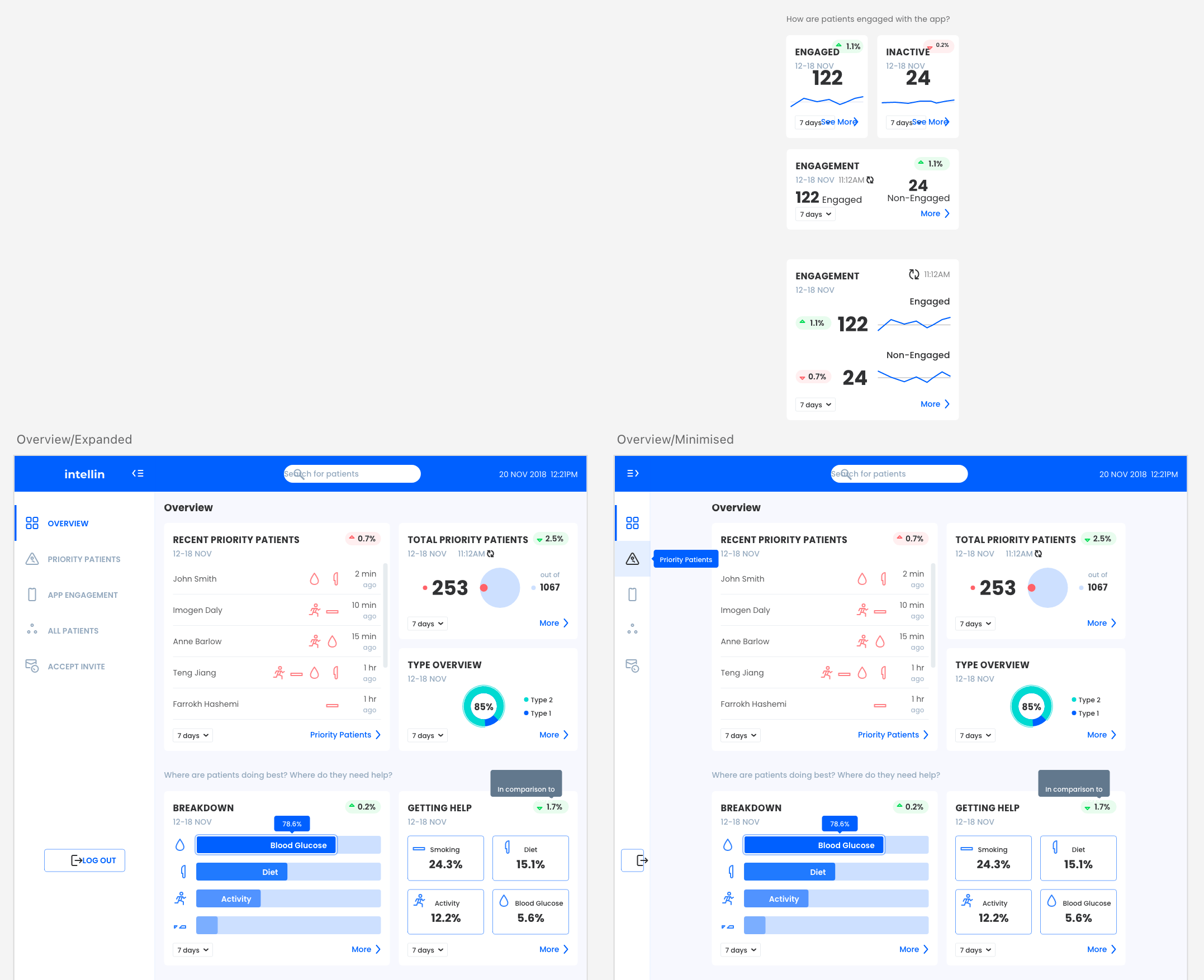
- Better Overview page - display crucial information based on the patient cohort (helping with triage), as feedbacked by the clinicians,
- A better way of linking the dashboard with the patient's app,
- Introduction of the Social Prescribing feature later on.
Our first v2 included features that we've built based on the feedback from the Diabetic Foot Ulcer study at Salford Royal Hospital, however, we were building the dashboard with scaling-up in mind, what it meant all the components (elements on the page) would be modular to some extent (e.g. if a clinic prefers to display a specific chart/info).
We've also received a lot of feedback during the HETT2019 days, here's myself in action talking to potential clients/clinicians.
Hello from @OrchaUK
#HETT2019
👋 Find is at AppZone, stand C76
#diabetes
#health
#technology
#mHealth
pic.twitter.com/5kDbkr76XW— Intellin - Diabetes Management (@intellin_)
October 1, 2019
The future and modularity
The Intellin dashboard is/was an ever-evolving platform, the features were constantly added or improved. Working cloesly with clinical team, and potential (new) customers I've collated all the feedback over the course of several months and iterated on our (business) vision.
Working with different clinics and talking to many providers we realised that despite the goals of primary care (are the same), the standards/needs aren't - there was no accepted "metric" when measuring a patient cohort. This is where the concept of modularity came to play. We've envisioned that GP's (General Practices), clinics etc. could customise the dashboard to their needs. The obvious place to start was the "Overview" page.