Halo Design System
At Newcross, in addition to other projects, I helped build and implement the Halo design system, including creating documentation with real-world examples so designers and developers would have reference points in practical contexts and scenarios.
I've kept the system up to date and in line with latest Figma features, bridging the gap between design and development and so that everyone on the team can be more efficient.
Starting point
Our design system initially comprised a single library file, which served as a good starting point. However, as the library expanded, managing and tracking changes to components across the canvas became challenging. This monolithic structure proves difficult to scale in the long term and leads to frustration when attempting to locate specific components scattered throughout the canvas.
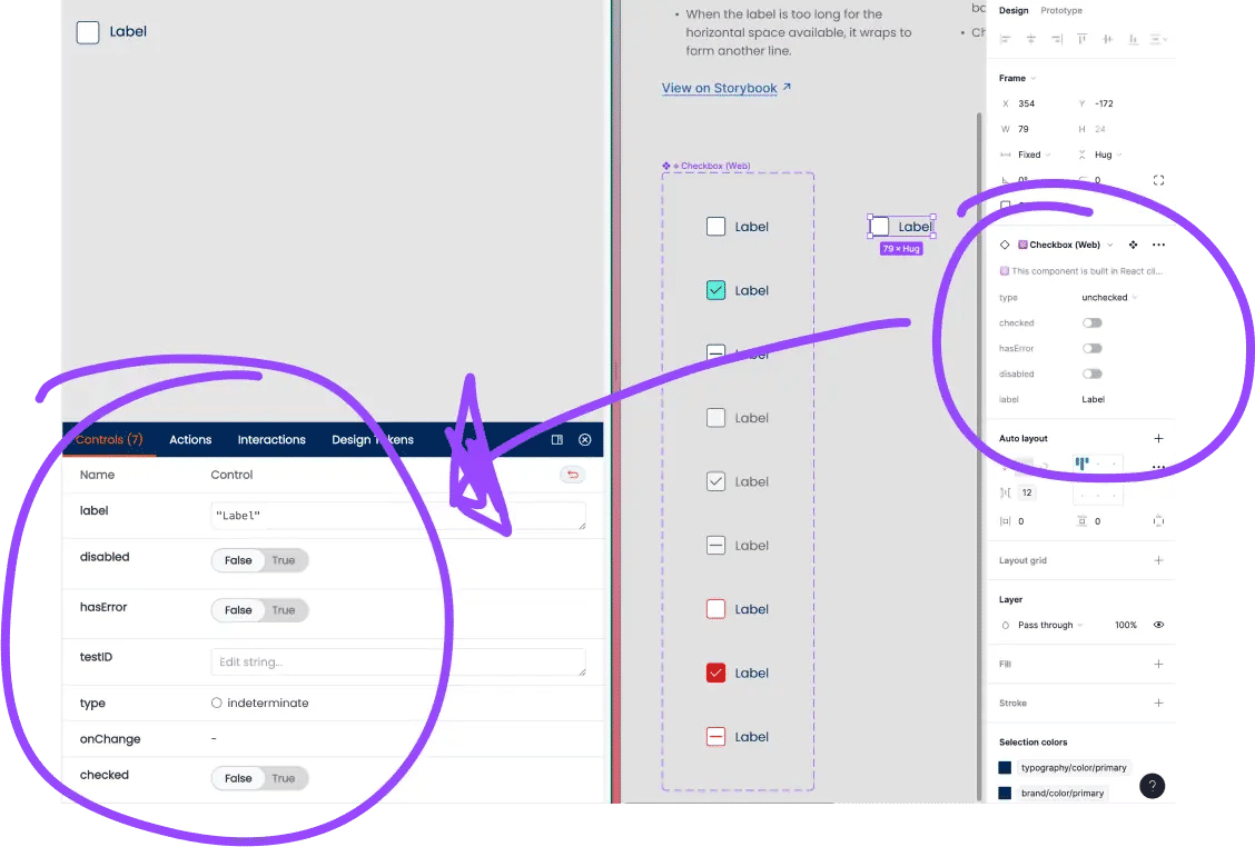
Adding to the confusion, we maintained two versions of components: one for the native app (React Native) and another for the web (React). These components frequently differed, with variations in props and structure.
Lastly, we didn't have a dedicated team to maintain the Figma library. Developers were working in a federated way, but things were often not in sync between the development and design teams.
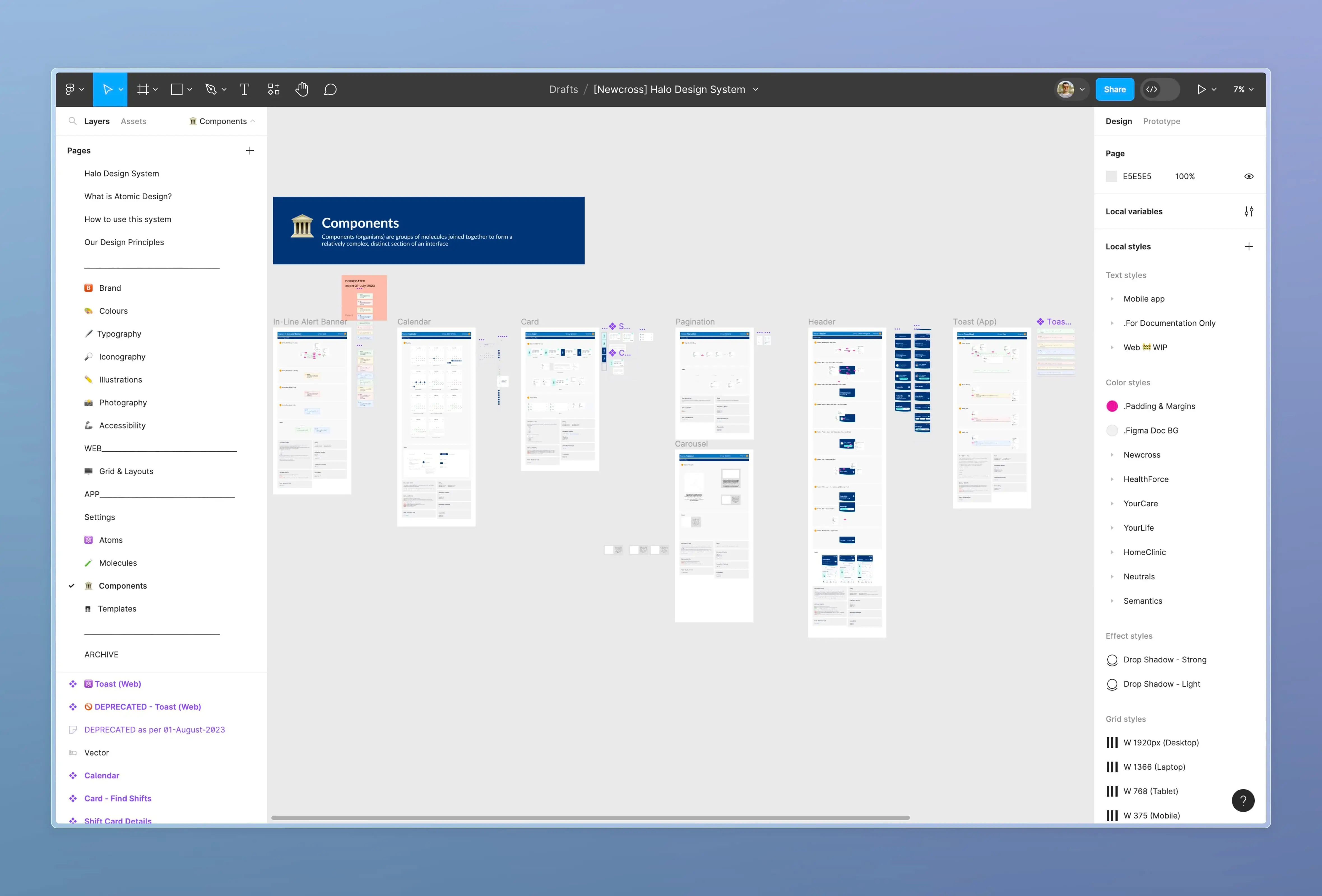
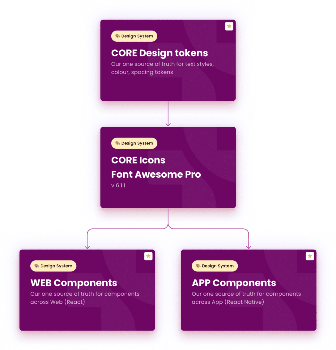
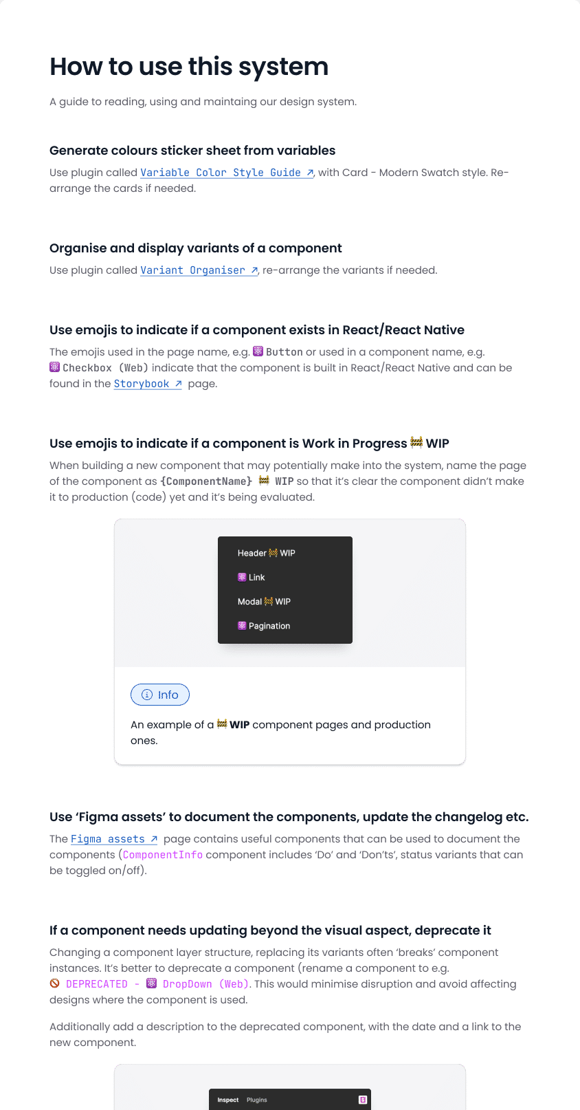
Splitting the library
To make the system truly scalable, I was pushing to split the Figma libraries so we don't mix native app and web specific components (given some minor differences between the two). This would align us with how developers handle libraries and packages - making it a no-brainer. Finally, dedicating a page to each component will organise things and make it easier to locate a specific one.
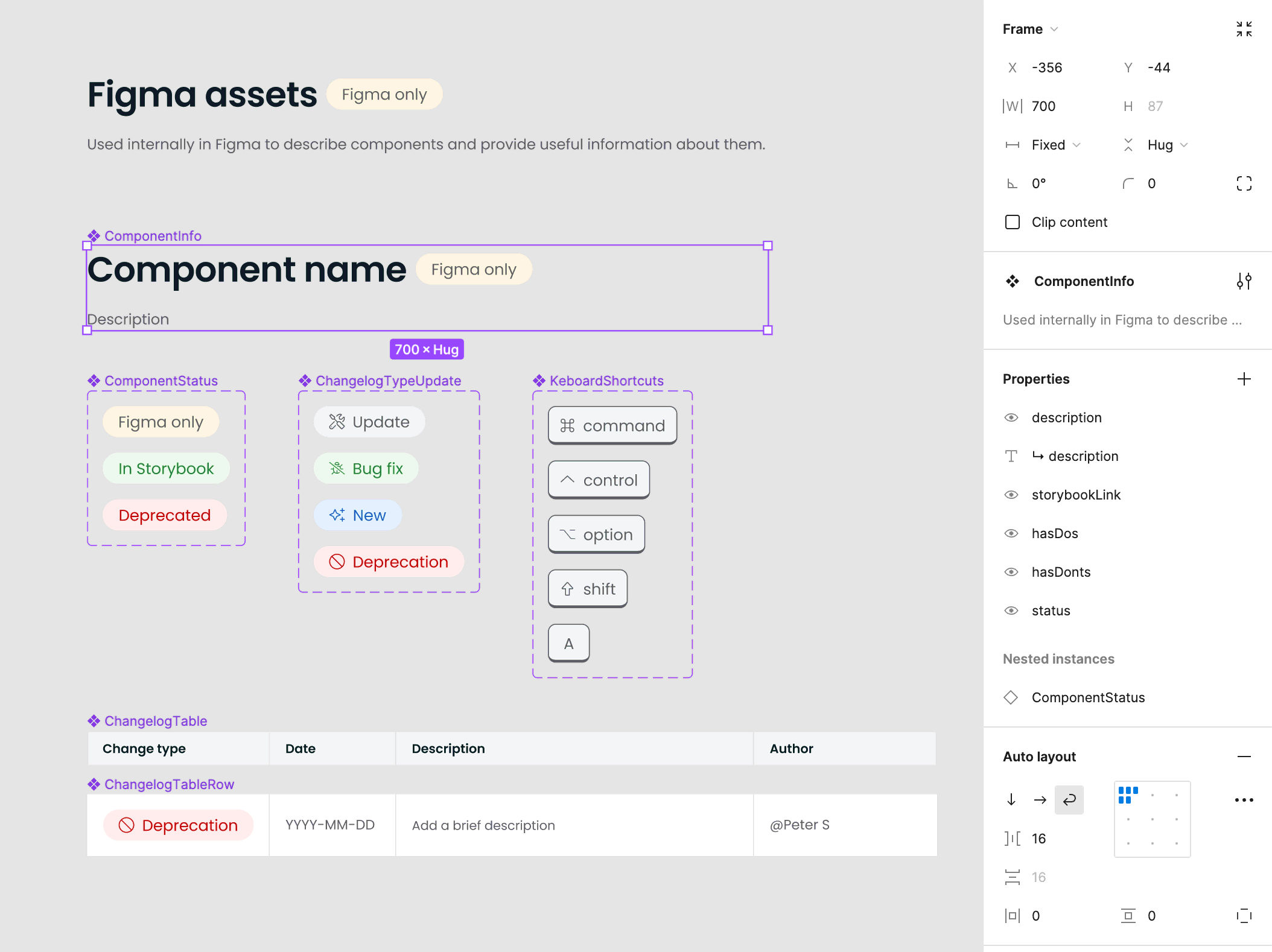
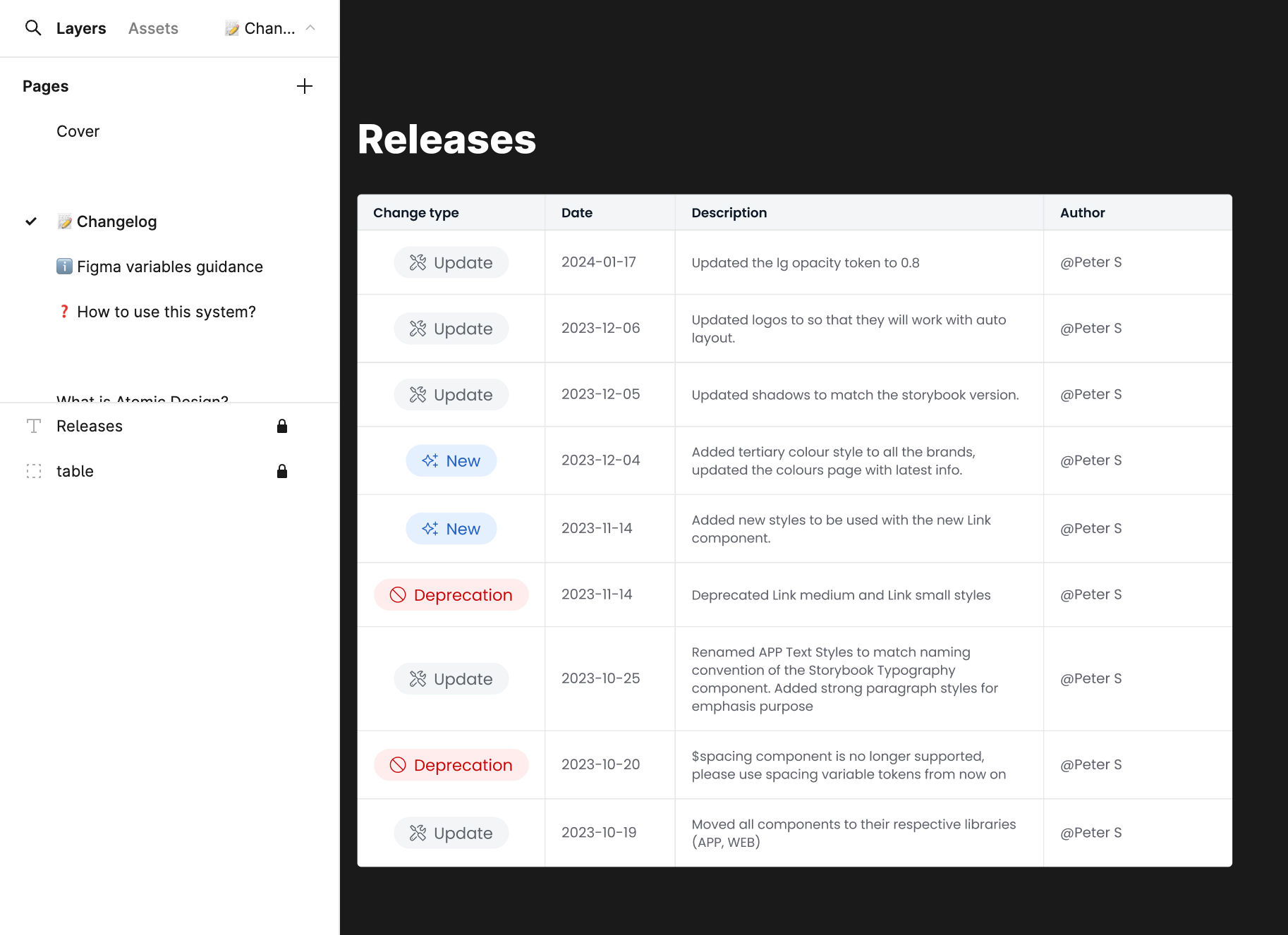
Documentation process
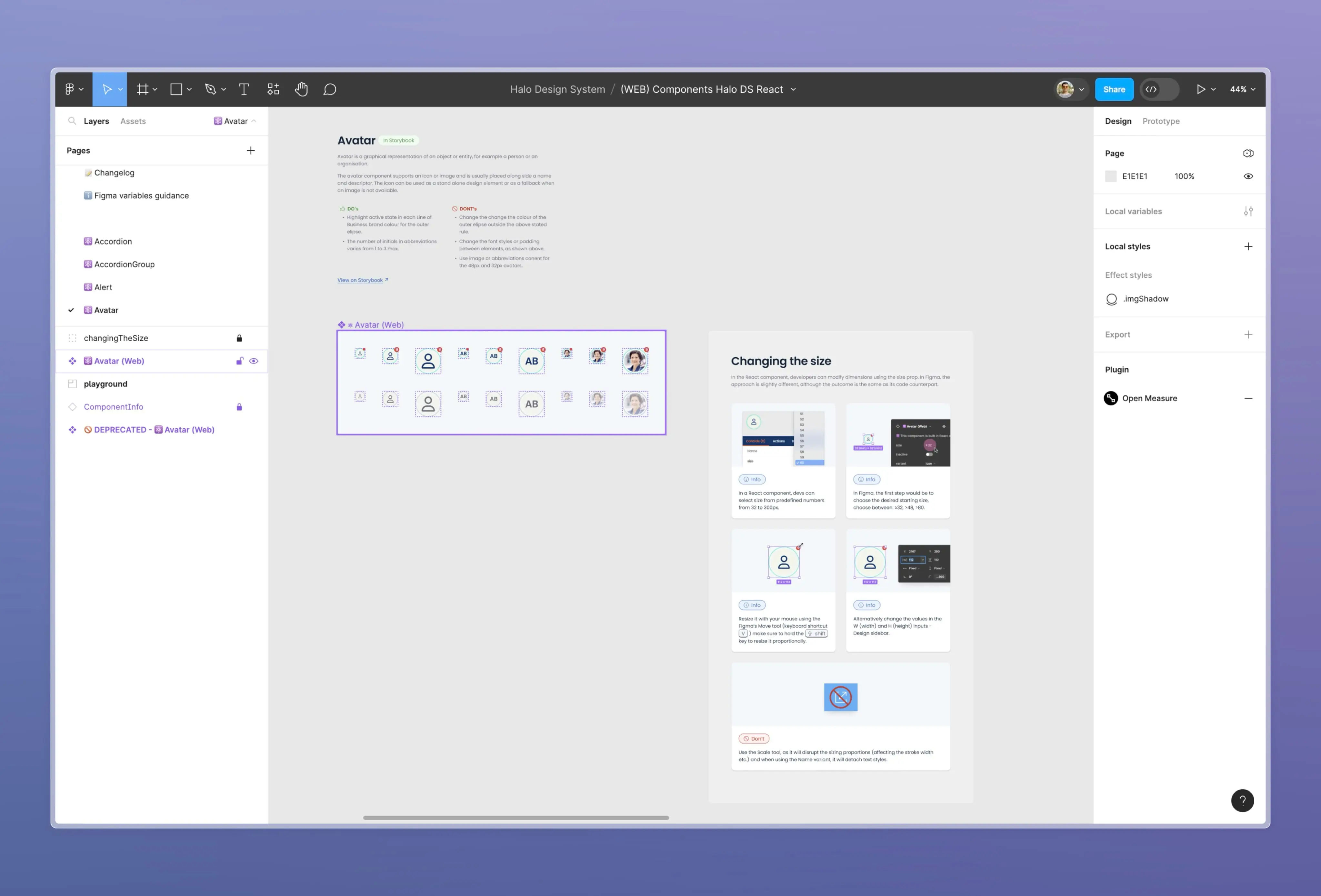
With a federated approach in mind, I’ve designed the system to be lean and easy to maintain. The documentation for the components is meant to be concise and straightforward, as I don’t want the system to feel like a unnecessary overhead.
I've worked with elaborate design systems that had excessive documentation, which over time became unstructured and low-value. I favour simplicity, balancing between too much and too little (to save time and effort) – but again, this largely depends on factors such as the size of the project, team setup, and specific needs.

In the end, it all boils down to keeping things simple but not too simple, finding the right balance between too much and too little (without creating extra work).
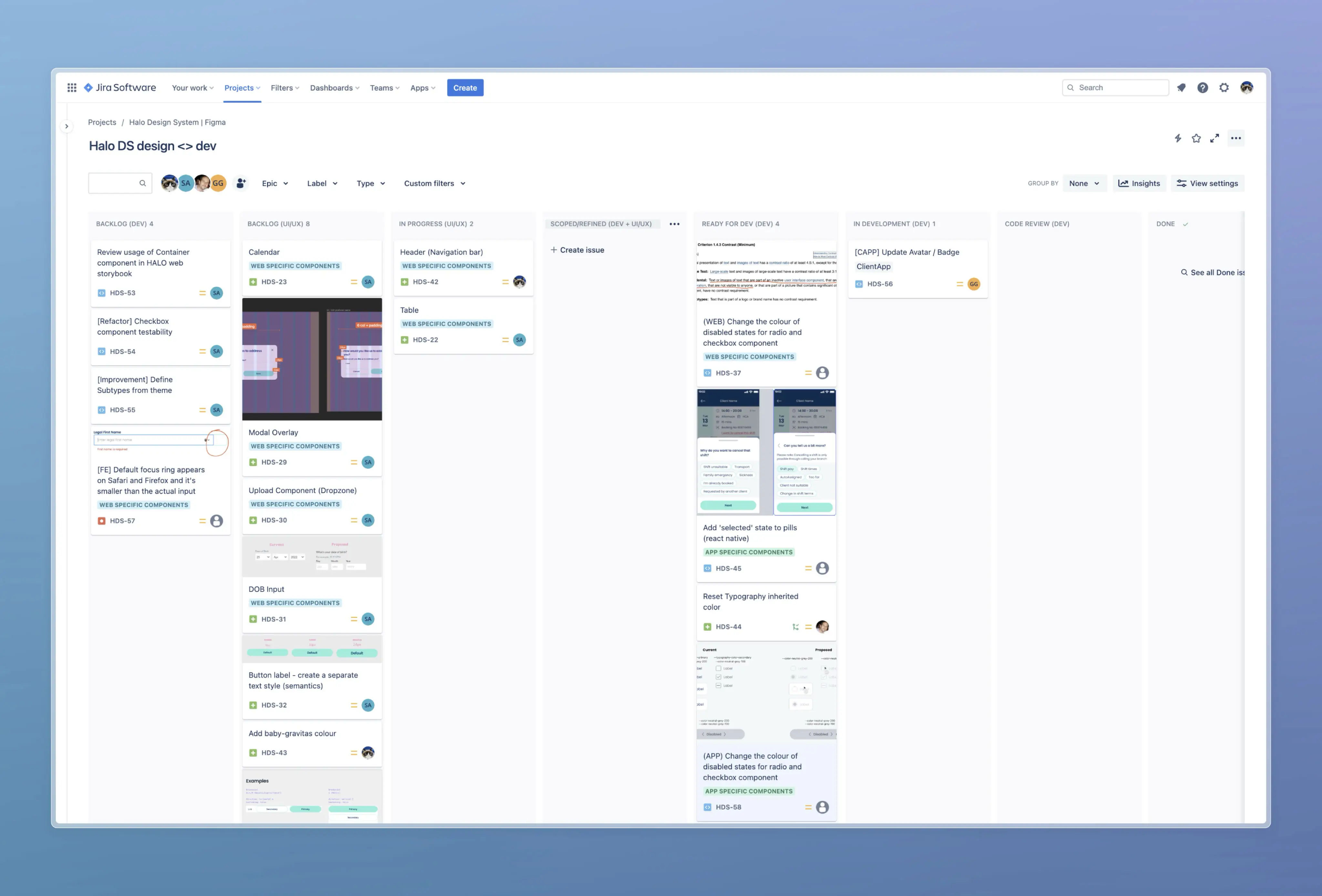
A lifecycle of a component (from design to code)
A design system relies on having processes in place - nothing built in Figma matters until a component is built properly in code. Given the challenges of our federated set-up, we’ve huddled together (design and dev team) and created a Jira board to track the component lifecycle, from ideation/concept to code.
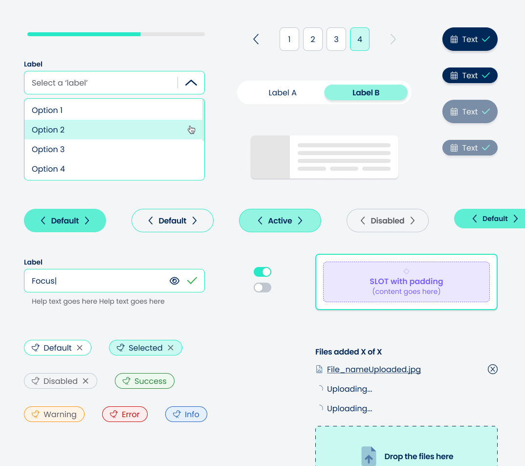
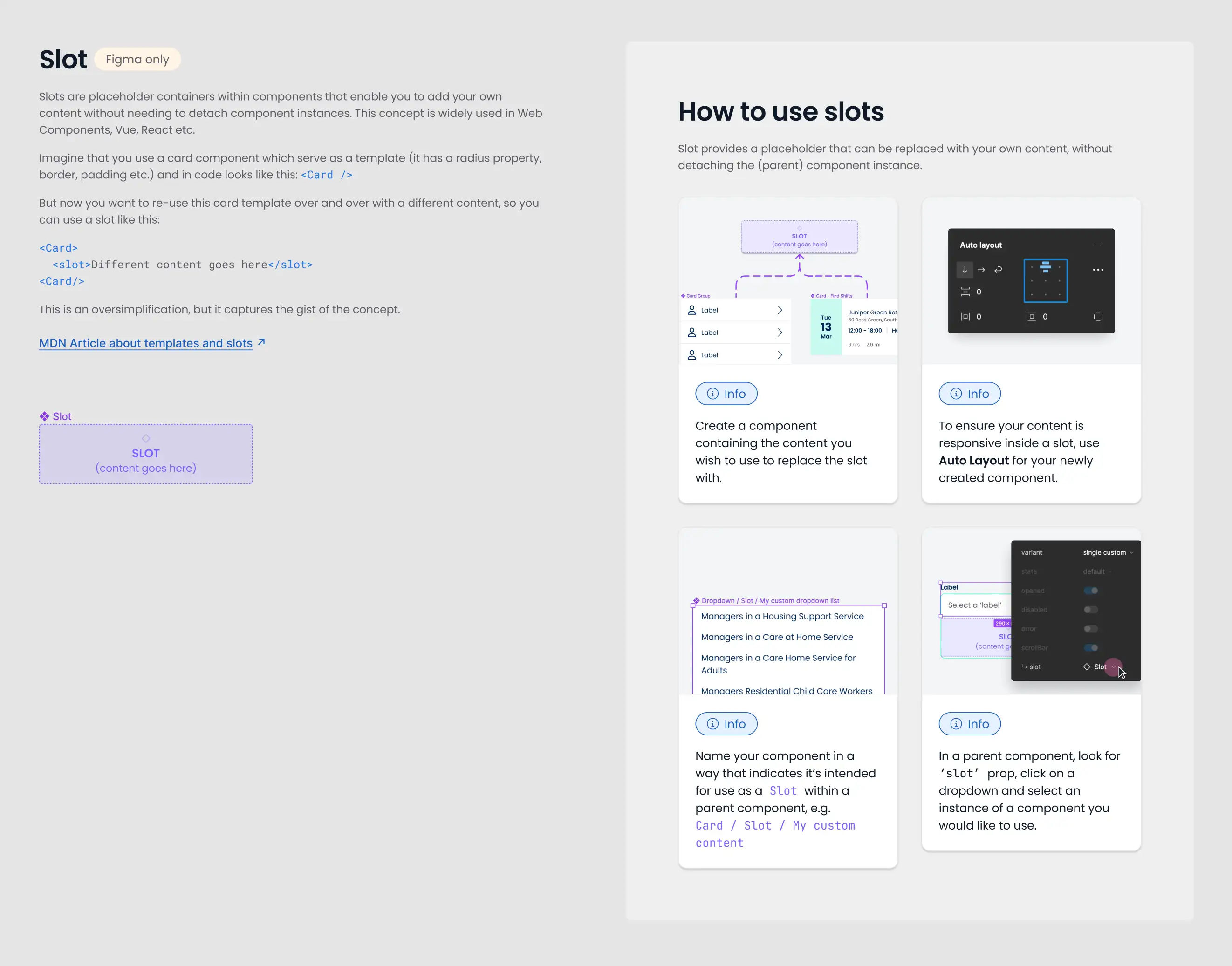
Re-usability and flexibility
The system had to be flexible to some extent, of course. I've built it with reusability in mind (as it should be!), introducing and explaining the slots concept so that other designers can leverage it.
Writing in progress...