Capsule Design System
Intro
At Truepill, I participated in contributing to the design system to deliver a seamless and consistent design experience. This effort resulted in improved consistency, faster delivery by teams, and allowed designers to spend more time on discovery and research rather than grappling with Figma components. I collaborated closely with the development team to ensure the quality of code components delivered to production.
Theme flipper 1.0
One of the challenges for our geographically distributed teams was to deliver bespoke designs more quickly. The Capsule Design System served as a baseline for building white-label experiences.
Around the time I joined Truepill, our solution involved using a fork of Tom Lowry's plugin called the Themer plugin, which we internally referred to as a 'Theme Flipper.' While there was nothing inherently wrong with the plugin itself, the workflow required numerous steps for designers and resulted in constant switching between the theme library and the project file.
Furthermore, our published Figma theme libraries began to grow, creating 'noise' among crucial design system libraries used in the company. Coupled with complaints from the design team about the involved steps and the inability to see updates immediately, this motivated me to search for a better and more streamlined solution.
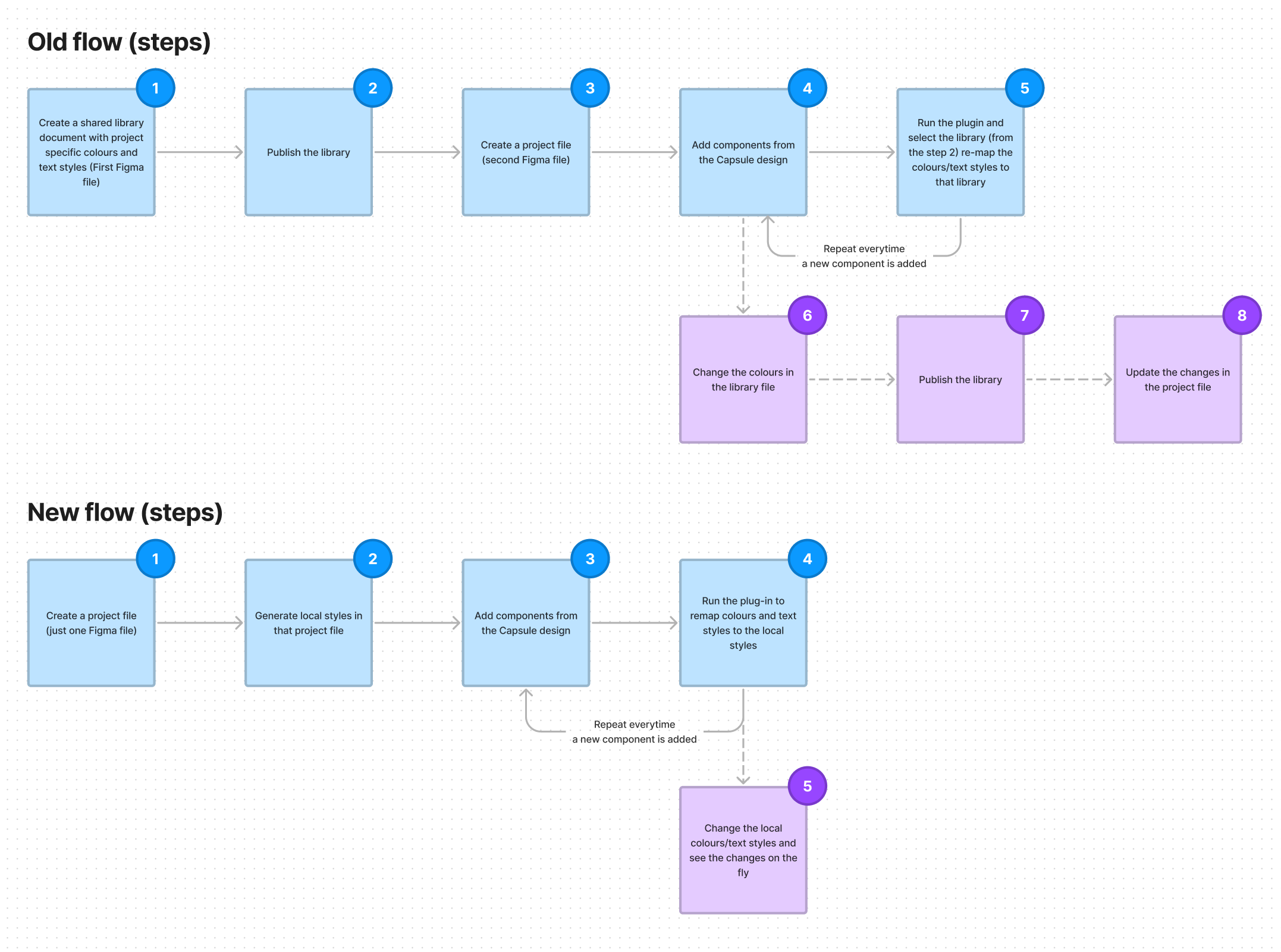
Concept to solution - Theme flipper 2.0
After spending numerous days researching a solution that would integrate seamlessly with the Capsule Design System, I sketched out a proposed workflow inspired by Andrei Iancu's Styler plugin.
How about the new icon?
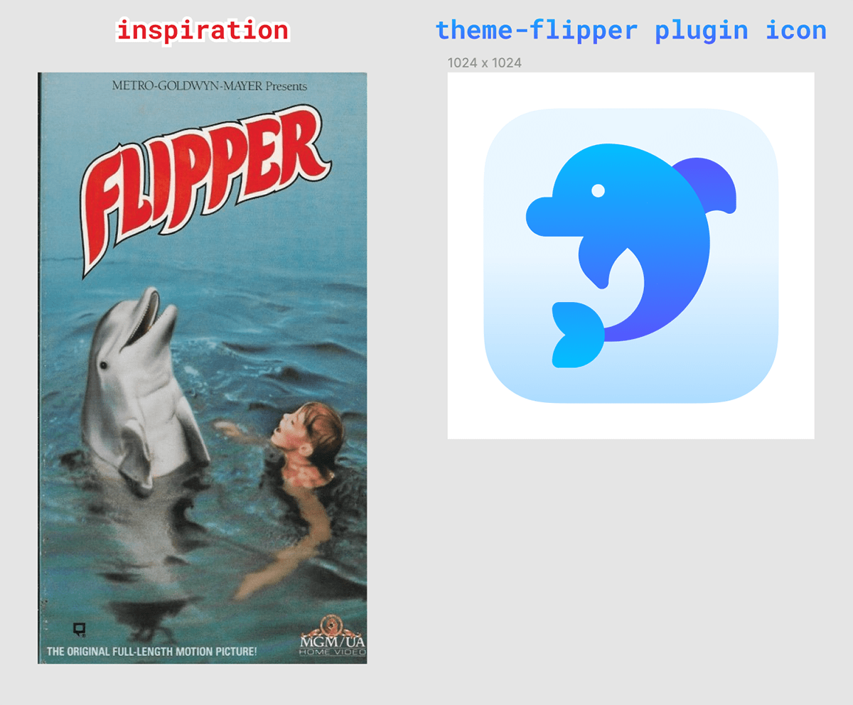
Results
We streamlined the process by reducing the number of steps by three. This time-saving of 10-20 seconds per ‘reskin’ action, when multiplied across the 12 designers who adopted the new workflow, has a significant impact.
When discussing the changes with my design teammates, they were delighted to see instant updates within the project, eliminating the need to switch between two Figma files (the project file and the dedicated shared library of styles). This not only resulted in faster project completion but also made collaboration less frustrating.
Theme Flipper 2.0 eliminated the need for loading any custom UI, a departure from the 1.0 version. Instead, we leveraged the figma.parameters method, providing a way to receive user input without the need for a UI - this contributed to the plugin’s faster loading times. Additionally, the plugin proved to be quick to develop and easier to maintain.
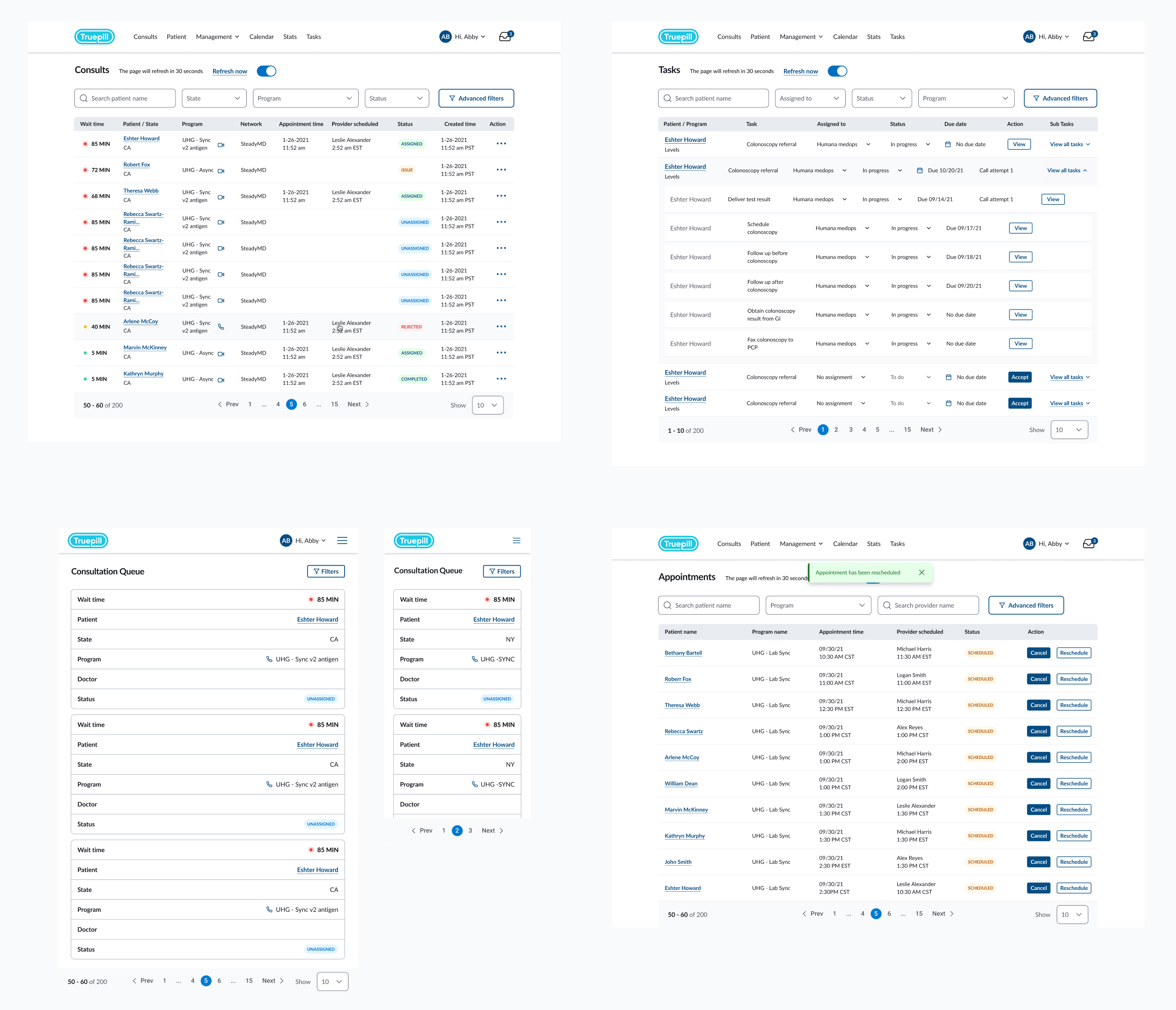
Tables
Tables were utilised at truepilll across various platforms, including internal systems and external (client-facing) products. These tables came in different flavours and sizes, each tailored to the amount of data they presented.
New table system
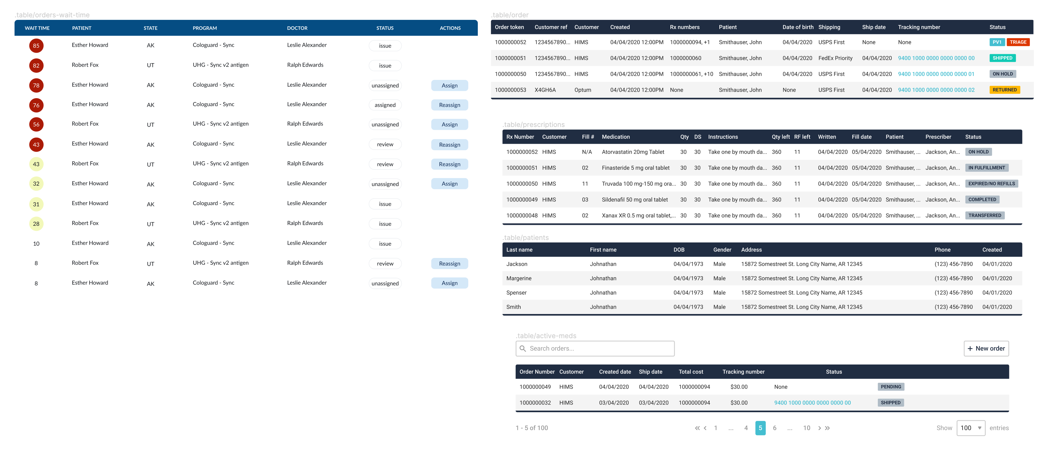
Now, with the Capsule design system I had an opportunity to make the tables visually better, indeed - but how about:
- improved accessibility,
- improved scannability (on hover)
- making it truly responsive
After numerous hours of research, I experimented with several table variants.
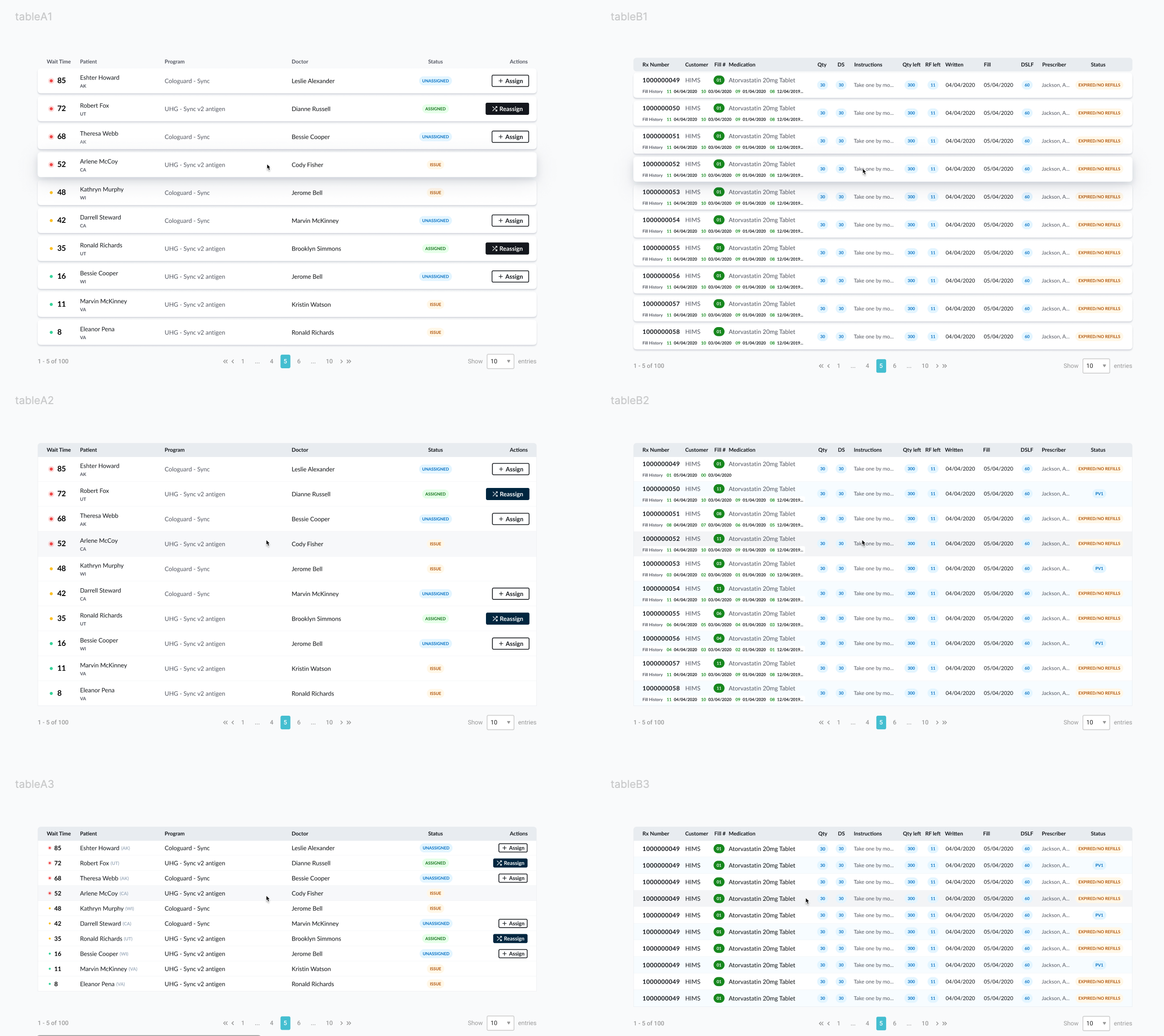
Details were also important.

Making tables responsive was also on the table (pun intended) - proof of concept.
Including some more complex views, also fit for smaller viewports if needed.
Results
The new tables have been implemented into our revamped internal EMR systems, enhancing accessibility and productivity. We were informed by the pharmacists that the new hover highlight feature helps in temporarily retaining information when looking at different screens. Furthermore, the text is much easier to read, thanks to expanded letter spacing.