Optimising the checkout experience at Truepill
Intro
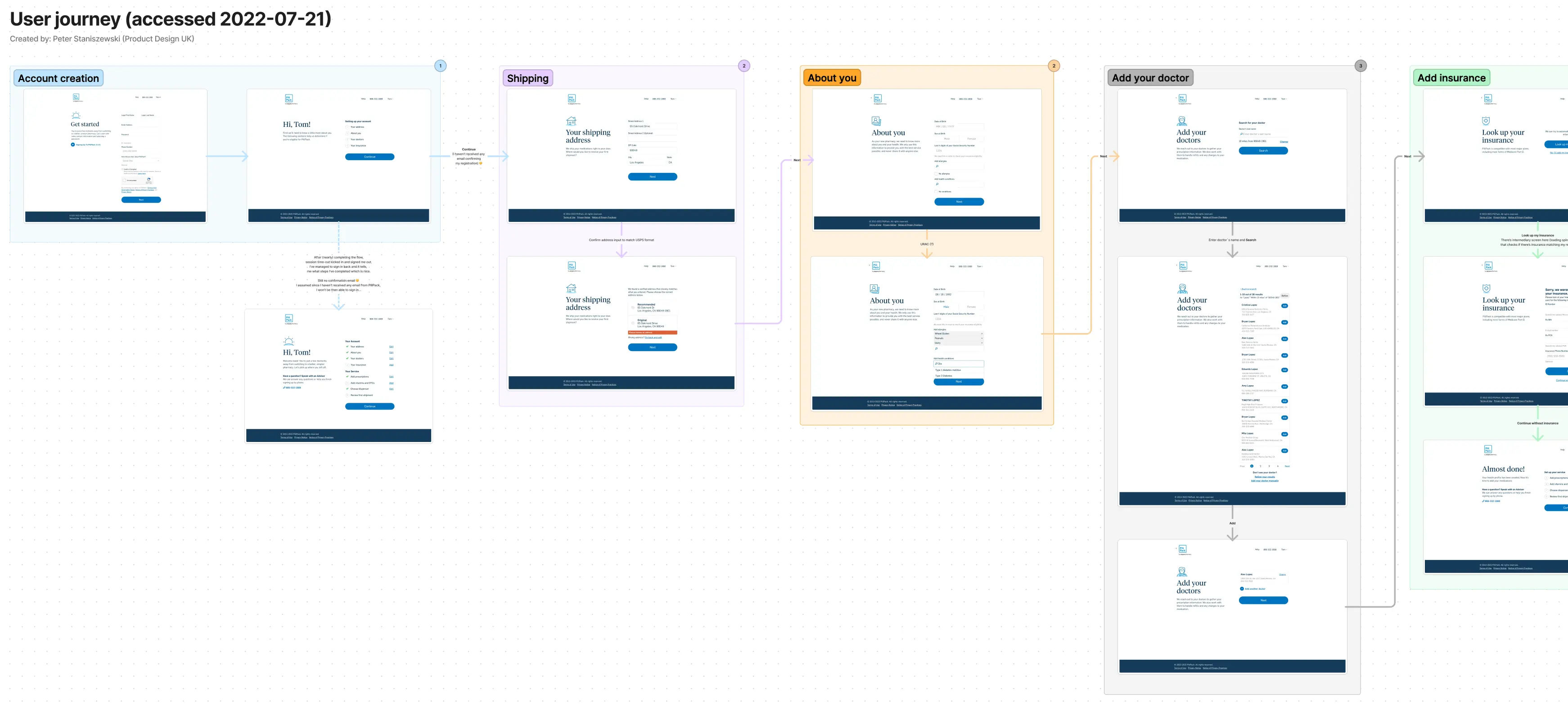
After working on end-to-end flows (such as YourRelief), I was assigned to be a part of the platform experience, ultimately leading and improving the checkout experiences across consumer health platforms.
Before, we used to copy and paste modules/components from other projects, meaning that some of the errors or bad experience being transferred over to the new projects. This project meant to federalise the work.
The process involved countless hours of research and meetings with other stakeholders like the engineering team, pharmacy ops, business ops and other designers. I was able to harness the power of design thinking and advocate for a better user experience and ultimately better conversion rates.
What I've achieved working on this project:
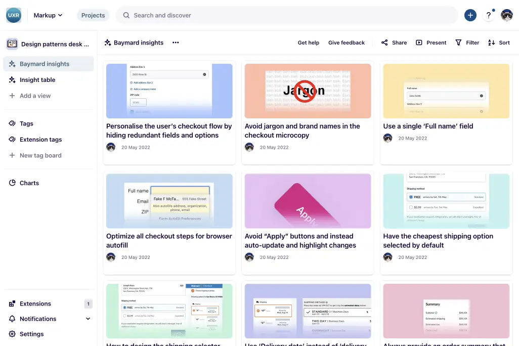
- Consolidated and shared with the team a collection of insights around better checkout experience (Dovetail),
- Conducted and lead workshops around the checkout experience (part of a cross-functional team)
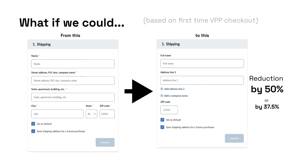
- Reduced the number of forms to fill out (from 11 to 8, 27% reduction),
- Used the pre-population logic for repeated fields (so the user doesn't have to type twice the same information e.g. Zip code on the Address and Payment),
- Utilising the power of third-party APIs, reduced the number of errors and costs involved with them, when the user provided the address that couldn't be verified e.g. against the USPS database
- Build (using a modular approach) Figma components and rolled them out company-wide
- Advocated for and helped build a more unified experience across different platforms using the white-label checkout components
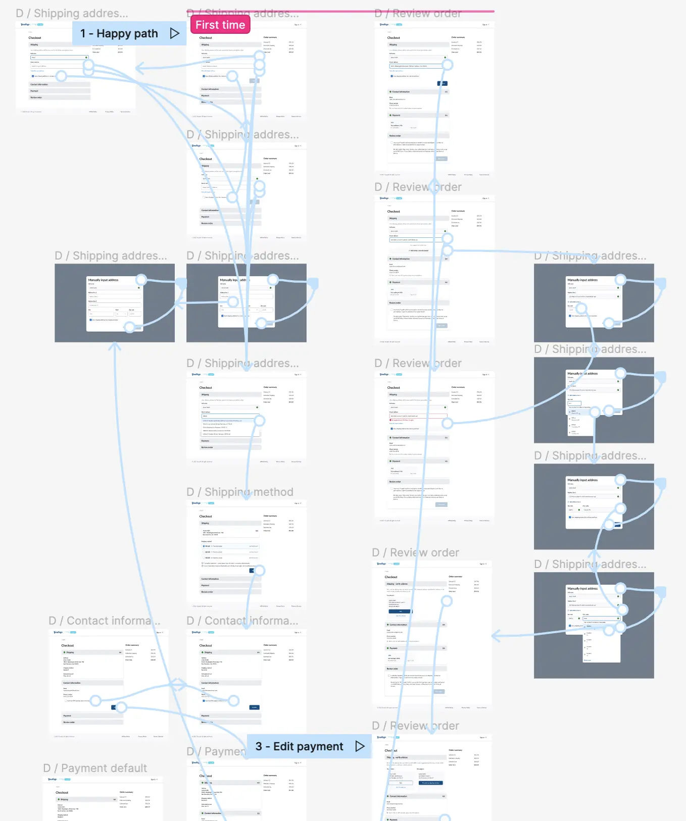
The flow
The flow of the checkout was pretty standard (think of what would you expect from going through the checkout experience), but before user landed on the checkout, it would have to go through a comprehensive set of question and information (see YourRelief for the full flow would look like). Experience that I gathered working on full e2e flows, helped me understand the bigger picture and better the checkout.
High level checkout only flow involved:
- Fill out your address details,
- Provide your payment method details,
- Provide a contact information (optional in certain experiences),
- Review your order and agree to additional T&Cs, Place order
The research
My research involved a combination of digesting information from great resources such as Baymard Institute, conducting competitors' research (looking at the entire flow from start to finish - checkout was usually presented at the end of the experiences) and working with the user research team to gather all the collected information based on the bespoke/custom solutions built at Truepill.
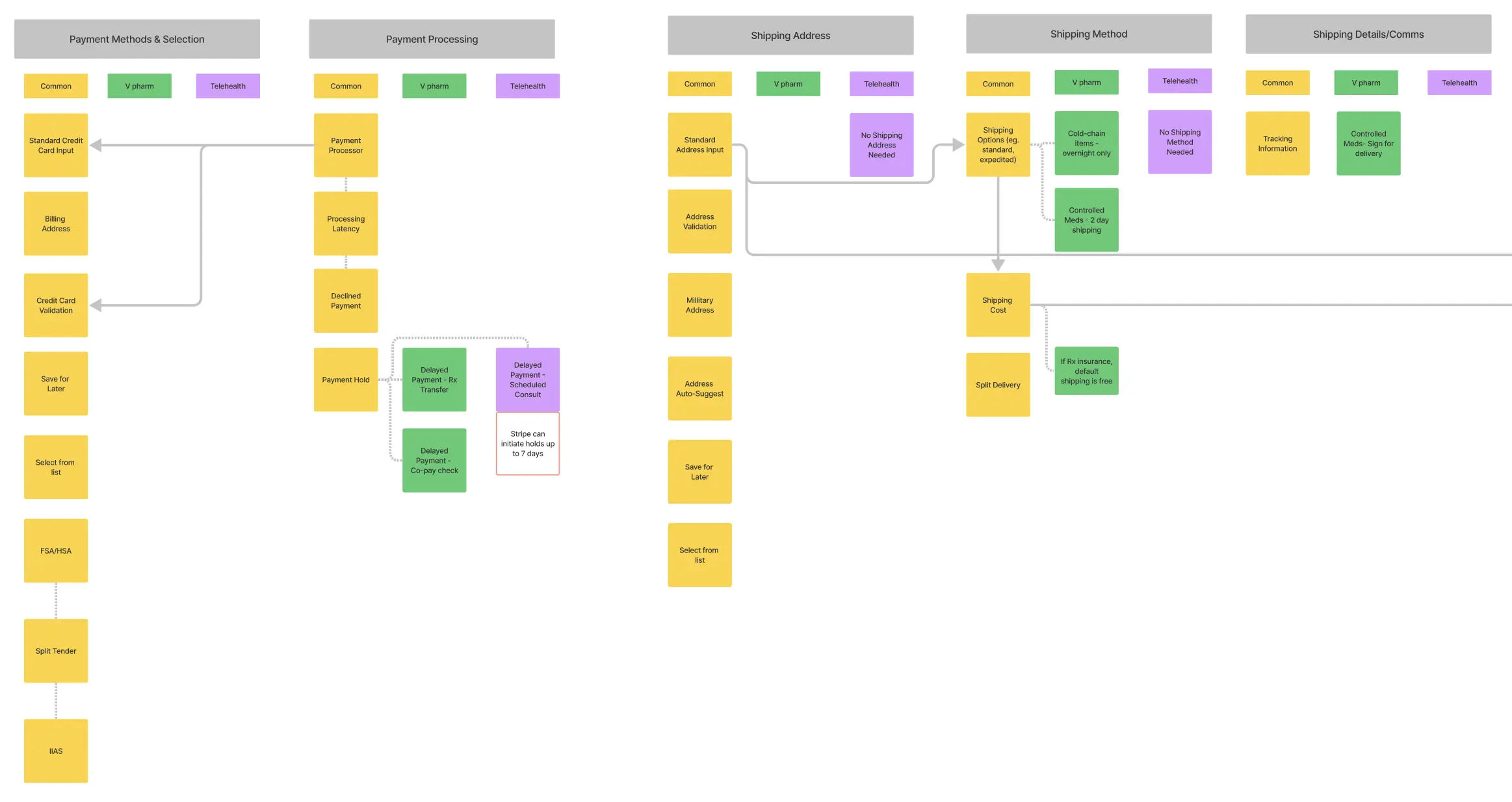
Working together with PMs and reaching out to other designers, we've collectively created story maps that gave us a better view of components, patterns and scenarios that are shared across different projects.
At the same time I was collecting and synthesising all the insights I could collect (from the sources such as Baymard Institiute) into Dovetail, so other teams (including vertical ones) can learn about the best practices and solutions.
There were a lot of touchpoints, a lot was happening in the organisation. Leveraging my position, I talked often to my fellow designers (from other horizontals) to find out what they were working on (while concepts of a platform were slowly settling in) and advocated for better patterns around the checkout.
Pitching to other stakeholders
Equipped with hours of knowledge and insights from other stakeholders, I've built a presentation and later on a prototype that would encompass the best experience (within the framework constraints) we could provide at the time.
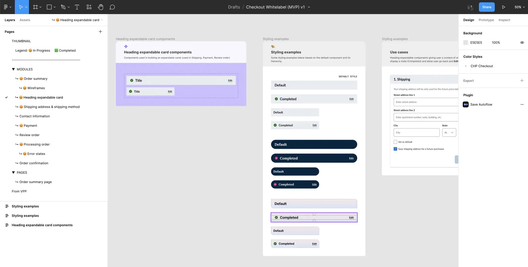
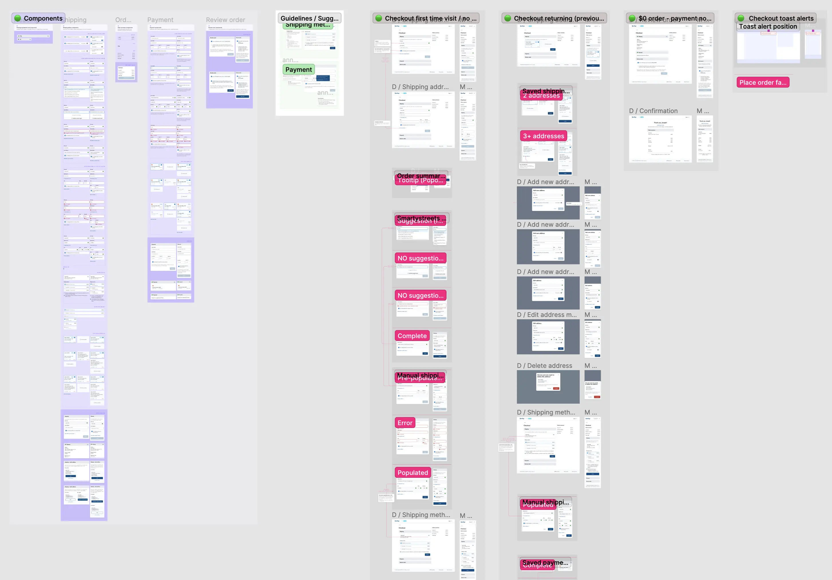
Building a checkout library
The very important part of this project, was to build a solid (but not too constraining) library of components - a design system of sorts.
I was looking at building a document, which would be self-descriptive and can be read by not only designers, but other stakeholders in the company as well.
One of my counterparts was overseeing other areas of the platform and worked in another document (the structure of the document was different from my own document), it made sense then to marge all the little pieces (pages) into one, whole checkout page.
And this is how the concept of slots was established, making the checkout components modular. For example, if a designer has to build a bespoke checkout experience that wouldn't follow the same (whitelabel) order, they could simply update the slot, or change the design in the Master component.
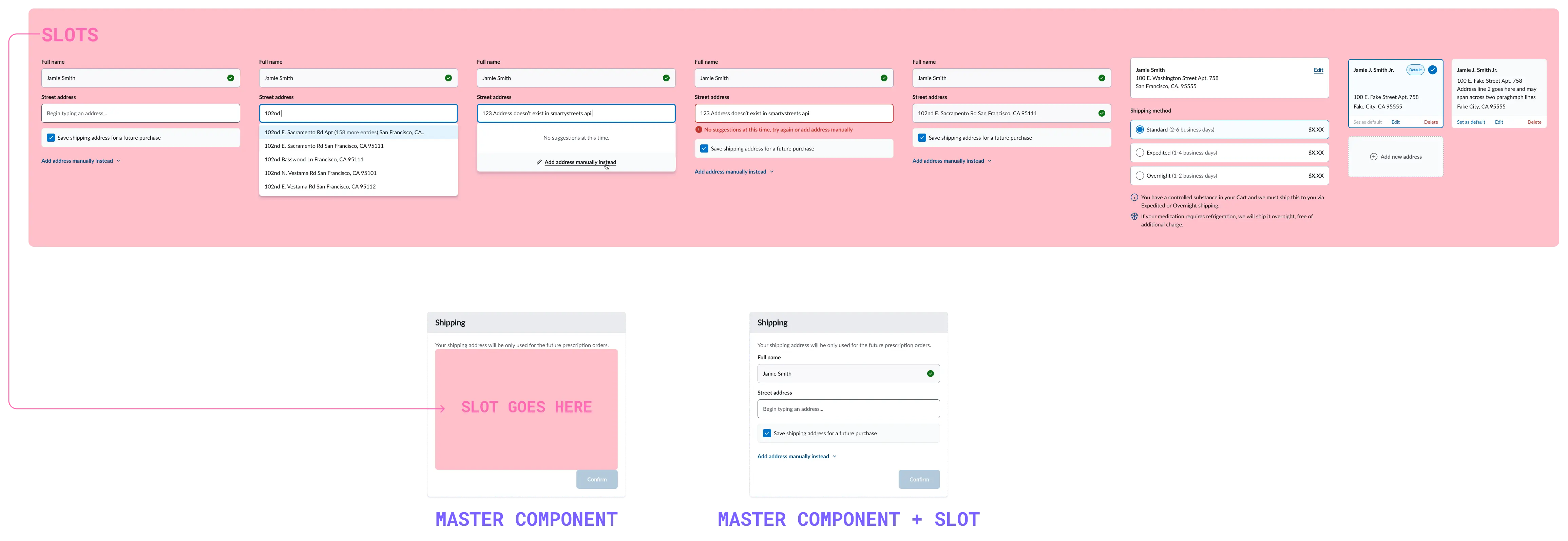
Like with every method, this one wasn't perfect - designer had to be aware that the slot is nested inside it's parent Master component, if they want to change e.g the state of the component. I found this method worked for us best at the time (given Figma capabilities at the time) giving us a balance of stearmlined parent components and it's props.