YourRelief
Intro
Tools used: Figma, ProtoPie, UserZoom, Dovetail
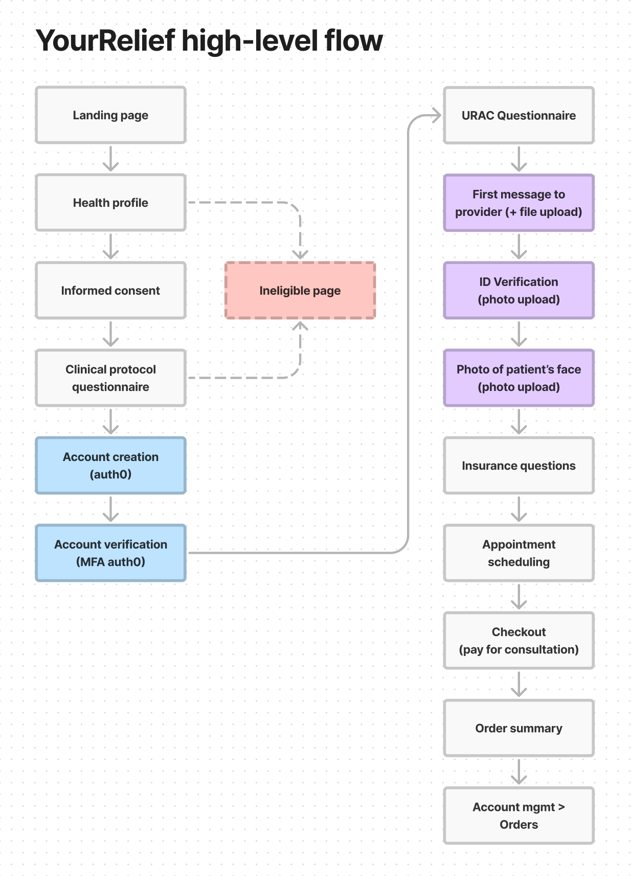
At the end of July 2021 we were approached by the pharma company - Astellas - to build a platform around OAB (Overactive Bladder - a frequent urge to urinate). The platform was then named "YourRelief" and encompasses the aspects of telehealth, checkout and fulfilment (vertical integration). I was responsible for designing the end-to-end patient journey, which included:
- User-flows,
- Account creation and verification (auth0),
- Questionnaire (clinical protocol),
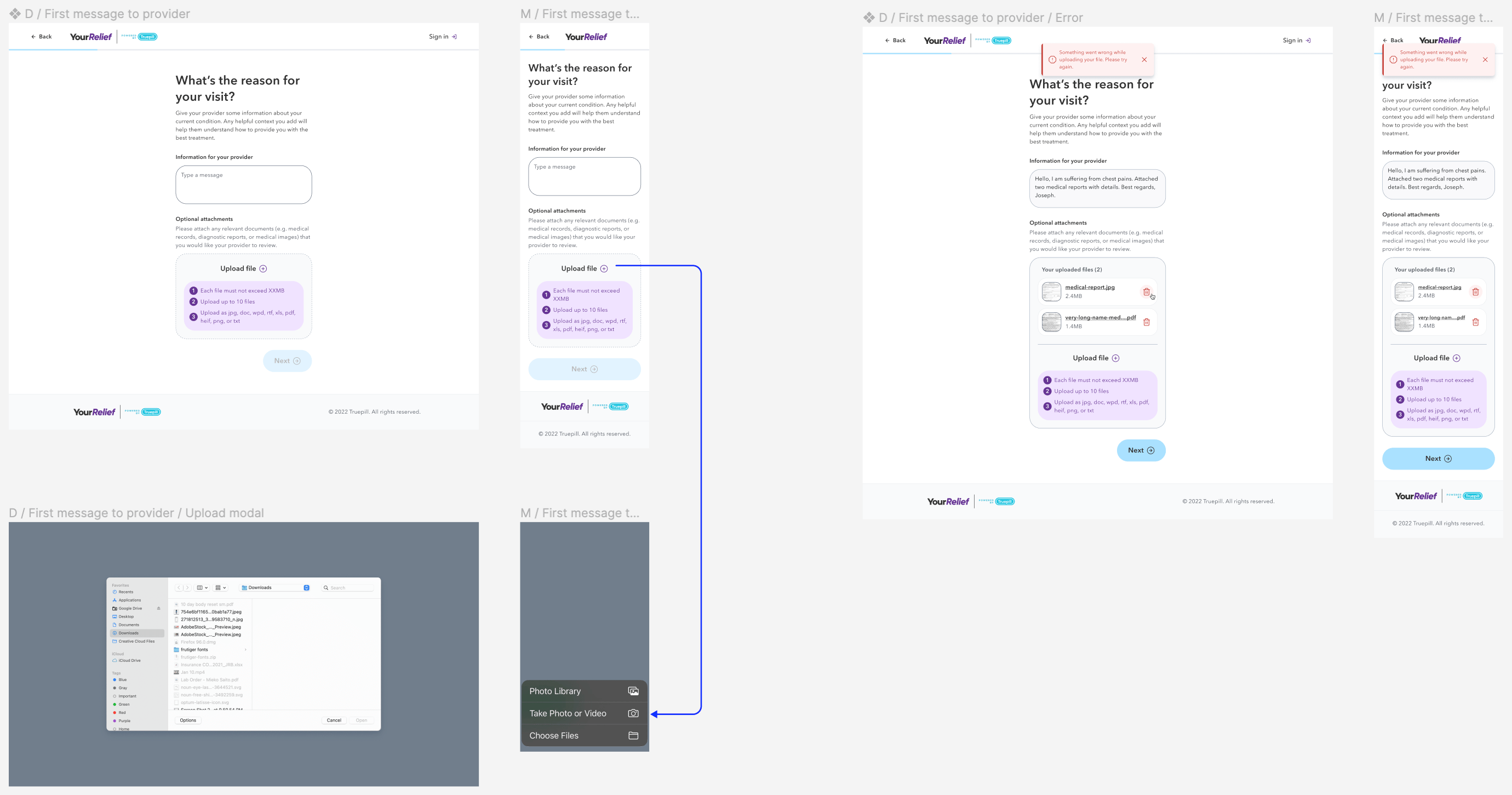
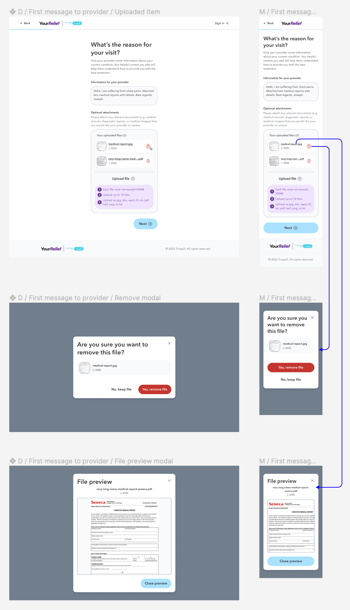
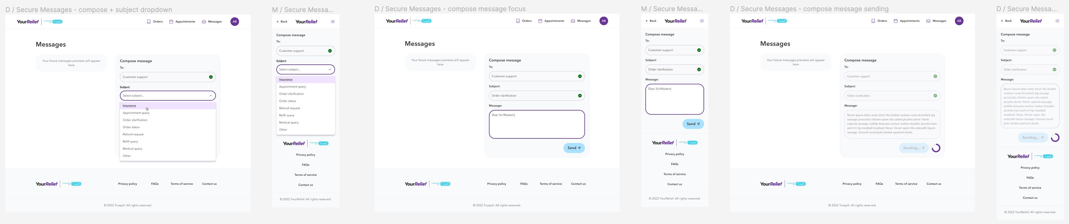
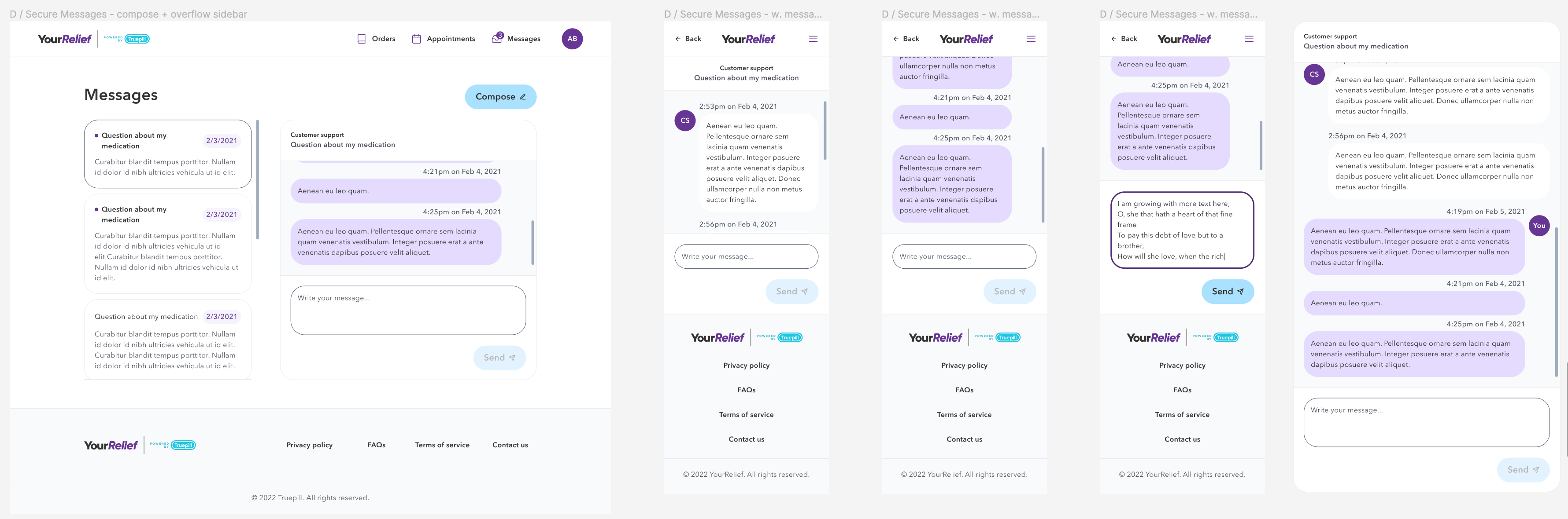
- Secure messaging + file upload,
- Taking/uploading a photo of the patients face (verification),
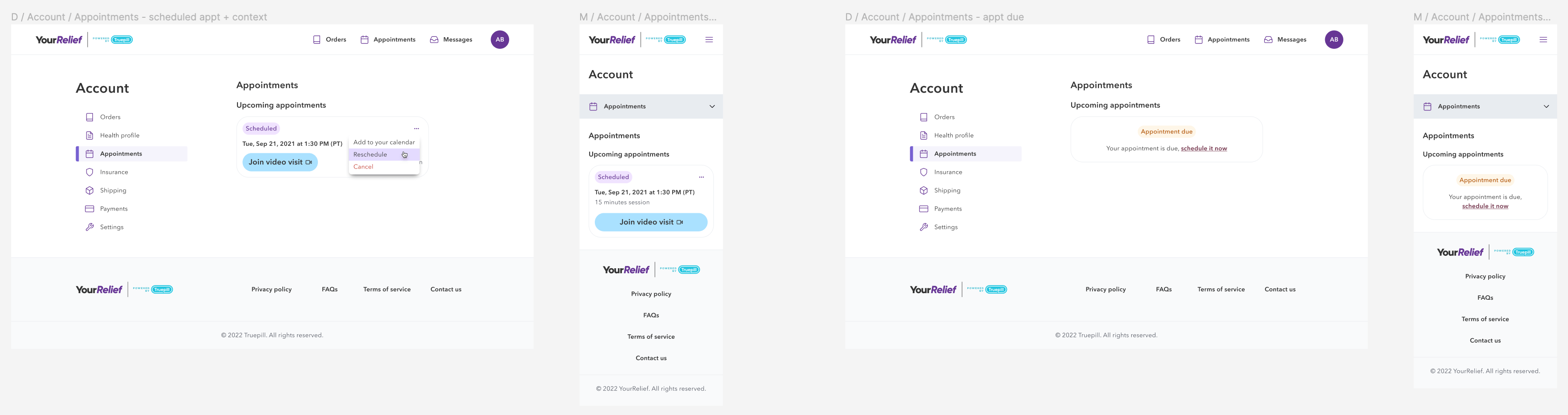
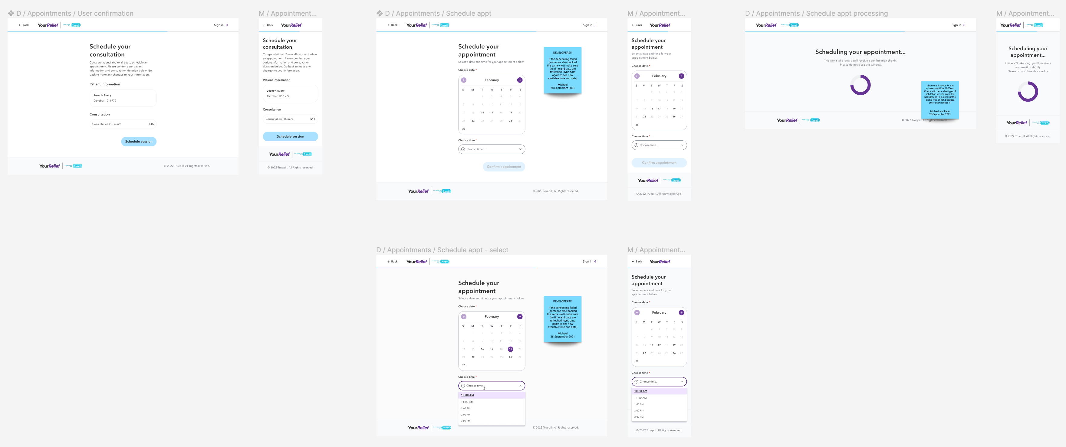
- Appointment scheduling,
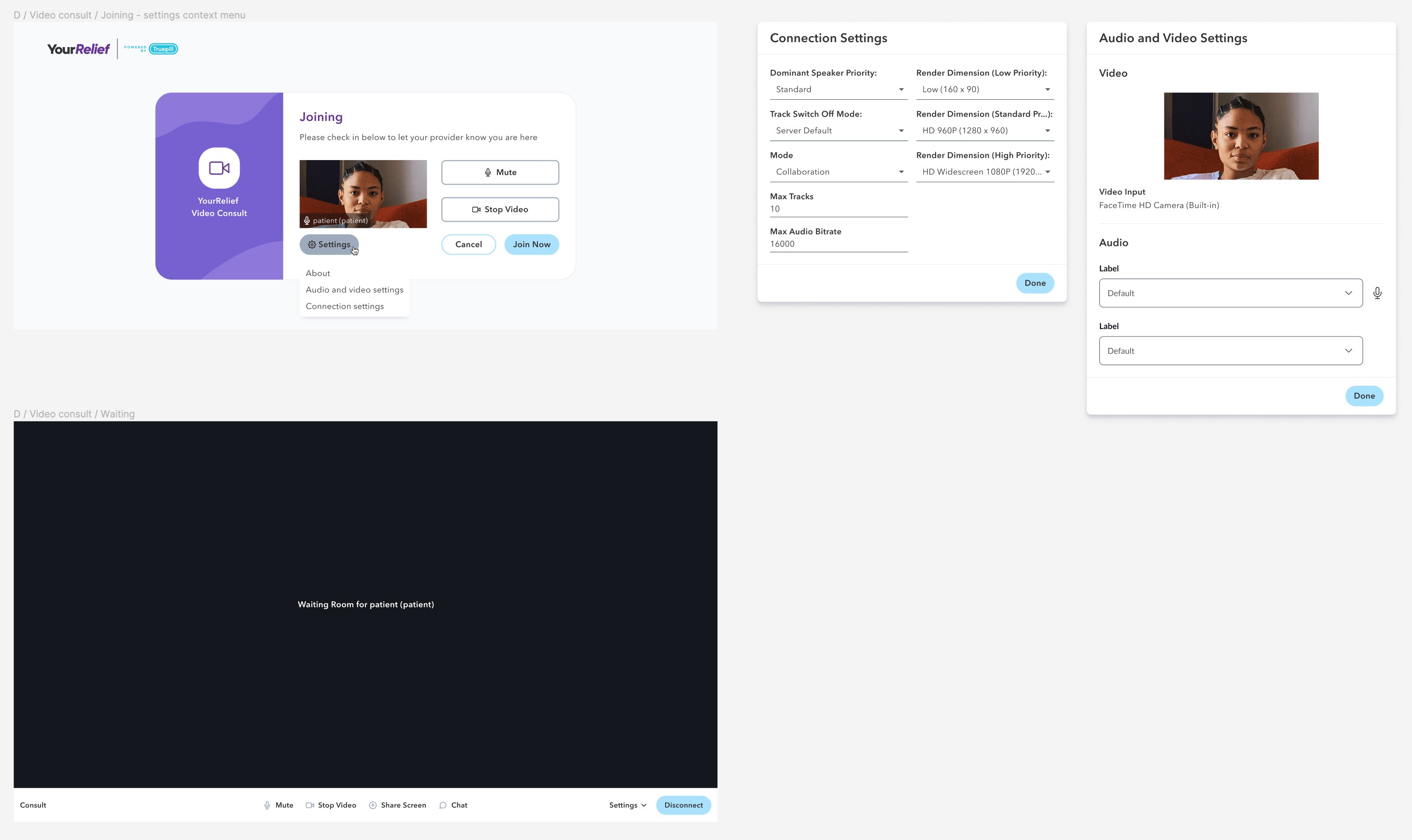
- Video consultation (Twilio),
- Checkout,
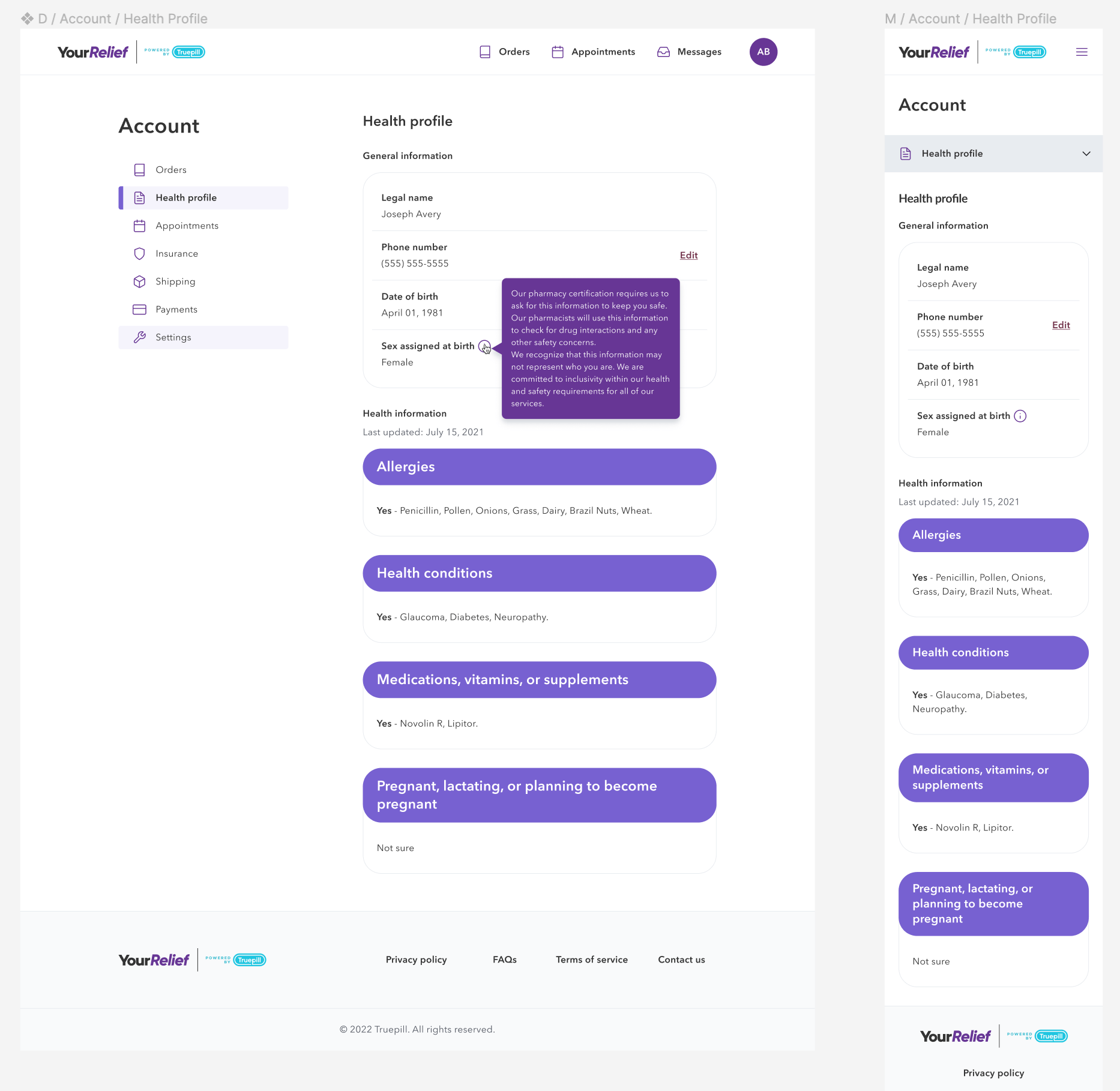
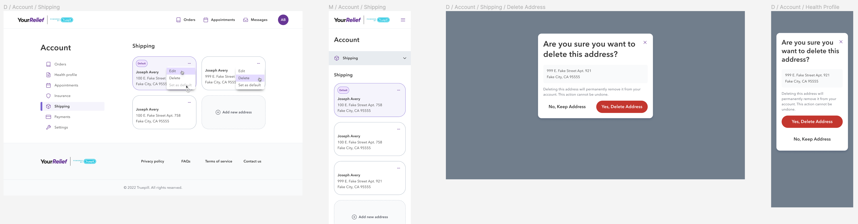
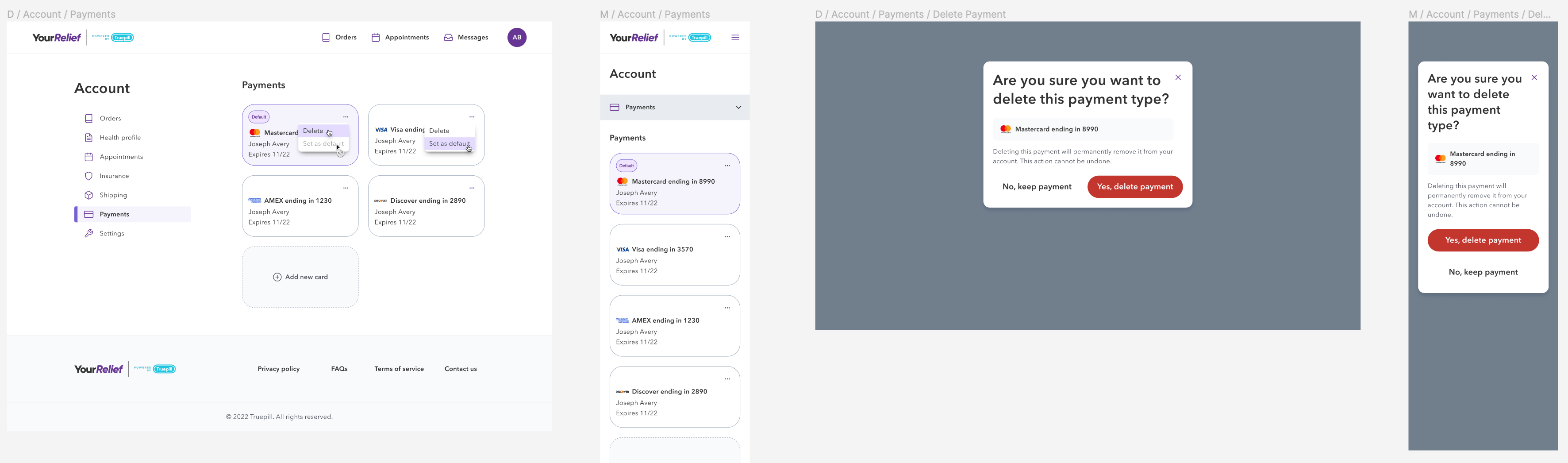
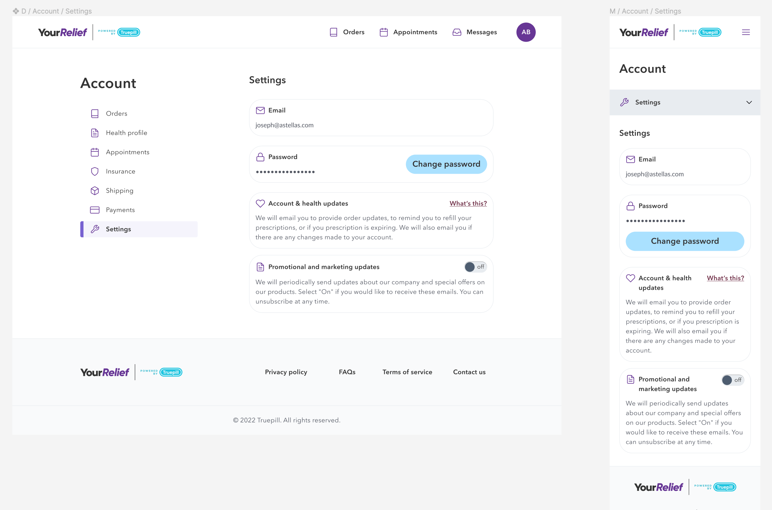
- Account management (view orders, change your details, update your insurance details, manage shipping and payment addresses, manage your marketing updates),
- Working with marketing team to design the landing page.
The platform is available at: https://www.yourrelief.com/
The journey
At the begining of the project, I had a rough idea of kind of touch-points user can expect. These points then, were added as we developed the project (e.g. "First message to provider" was added later on, so the platform can operate in more states in the US)
The design (white-label to brand)
Working on the YourRelief design was quite fun: the client didn't give us any directions regarding the look&feel, which meant we could pitch some concepts to them. Since I wasn't involved in the talks, I let the marketing team to drive style concepts. At the same time I was building the designs using the white-label capsule look (our in-house design system) and working with the developers on a new Theme Flipper plug-in (read more here ↗︎).
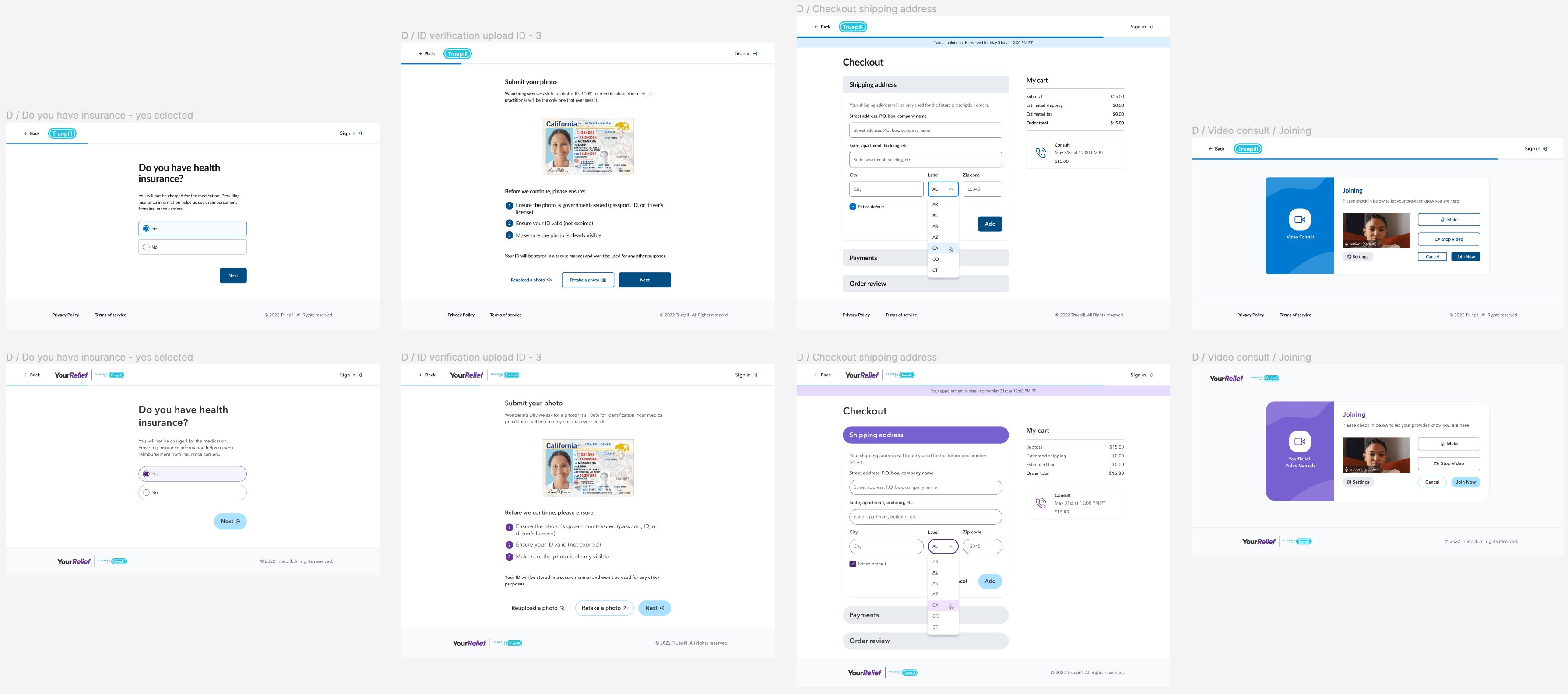
So, how did this work exactly? How was the theme changed? It was mainly done with the Theme Flipper, our internal theming tool that wasn't released company-wide at the time. This was the first time I could test thoroughly in production. As a bonus, I've used a Rad Dude plug-in that make changing the radius faster.
Features
Beyond account creation, questionnaire, checkout etc. I was also working on the features such as:
- Account management (order history, appointments, insurance, shipping, payments etc.),
- Secure messaging,
- Video consultation,
- FAQ among others
Account management
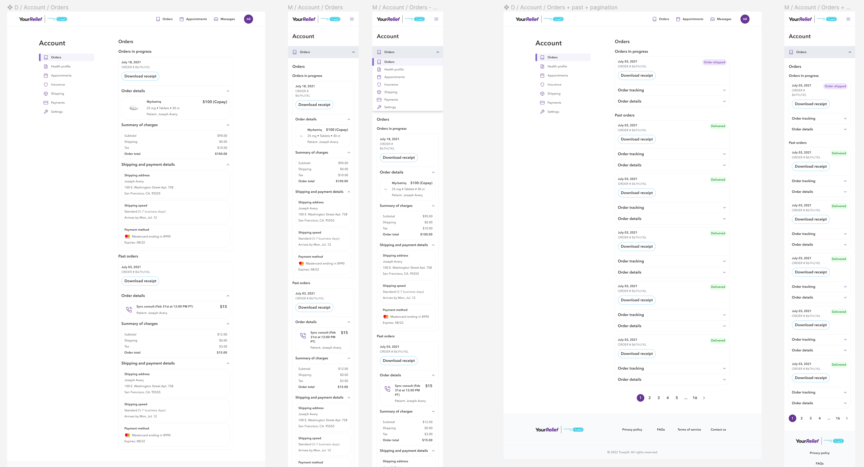

Other areas/components of the platform

Research and testing
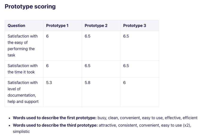
I've researched the project in its various stages, one of the crucial ones (pre-launch) was to determine whether the user prefer to answer the questions or create the account first. We believed that placing the account creation after the health questionnaire was the most optimal solution, but wanted to gather more insights just to support that conclusion.
Each prototype flow (Flow 1, Flow 2, Flow 3) had the "Create account/Sign up" page placed in a different place in the flow. After each task, participants were answering the after-scenario questionnaire (ASQ) and rated the flows.
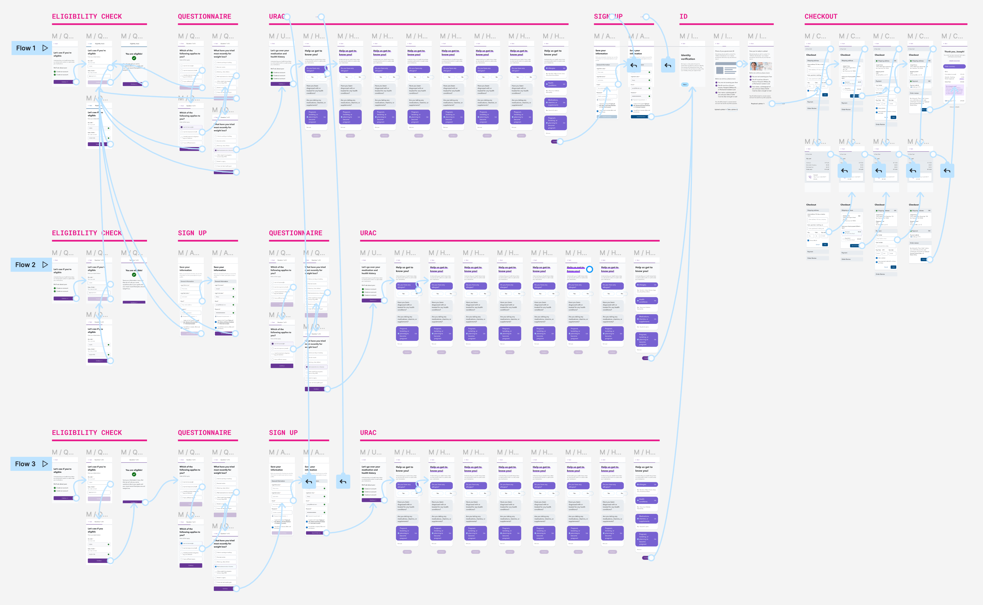
From this unmoderated research, we've determined that:
- The question about the Government ID screen made people pause, one participant was quite hesitant about uploading sensitive data online/into the cloud,
- There were no major usability issues with the flow, they were easy to navigate,
- Just one participant clicked on the cart icon, in order to check what they were buying, this pointed to the poor affordance of the cart components and made us re-consider the design of the icon,
- One of the participants found the journey lengthy and suggested cutting down the flow into 1 or 2 pages.